My Projects
Dogs Trust – #Family Pawtrait

The penalty for dog theft in the UK is currently based on the monetary value of the dog, rather than the emotional value to the owner. Dogs Trust wanted to approach the Sentencing Council to suggest they review their guidelines to reflect the fact that a dog is much more that just a pet – it’s a part of the family.
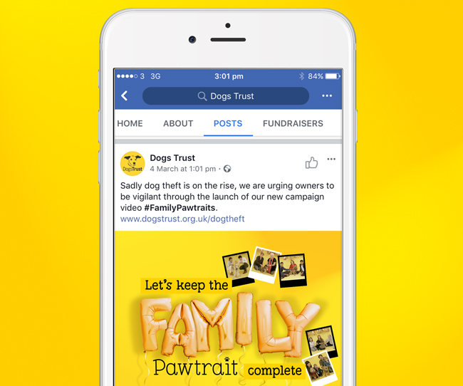
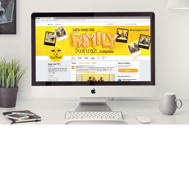
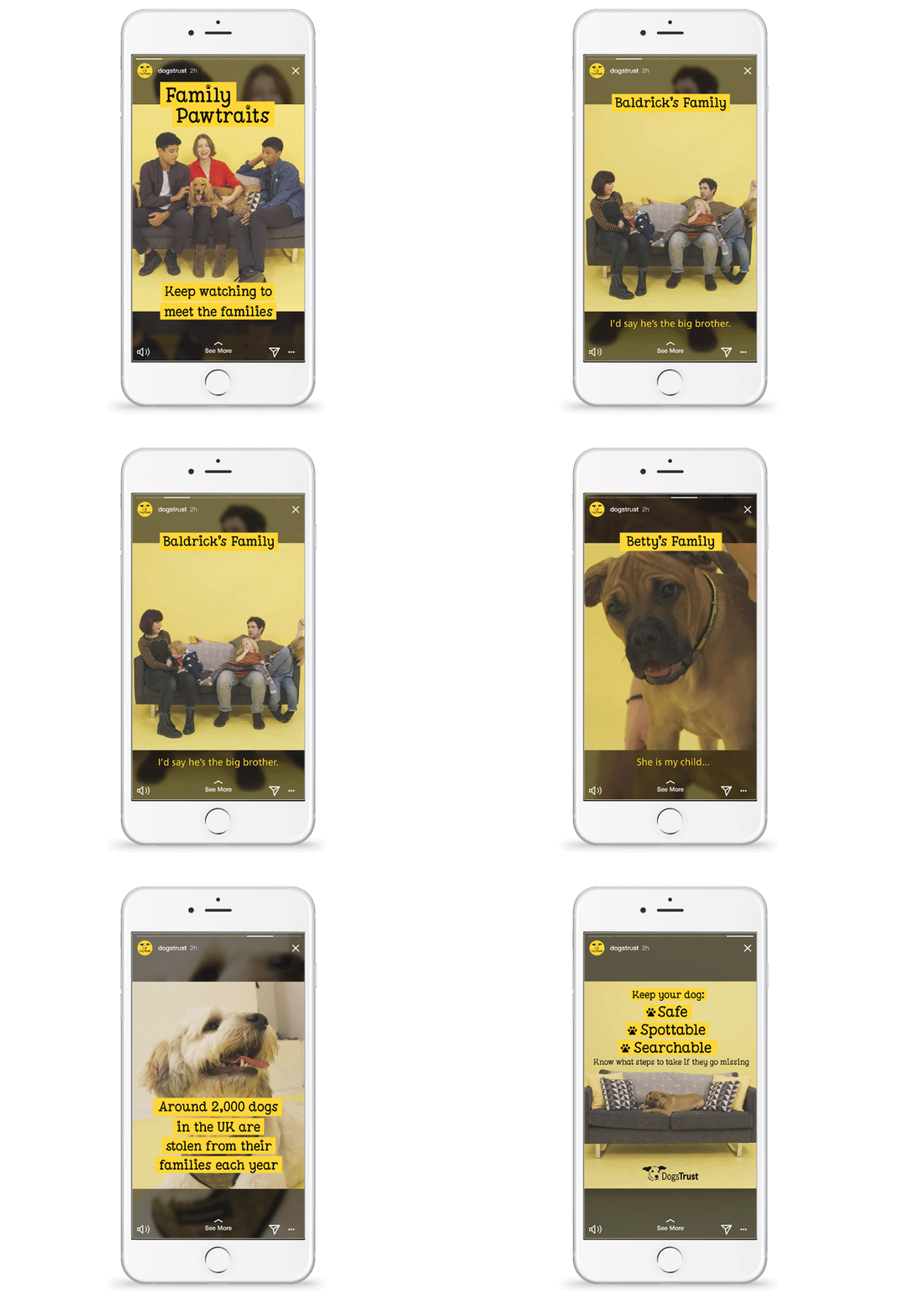
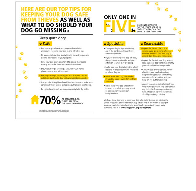
I designed a range of deliverables to support a film on the Dogs Trust website, encouraging people to keep the #FamilyPawtrait complete. Posters and factsheets could be downloaded, giving advice to people on how to keep their dog safe, and what to do should their dog go missing. We raised awareness on social media, creating an Instagram story and taking over the Dogs Trust Twitter page.
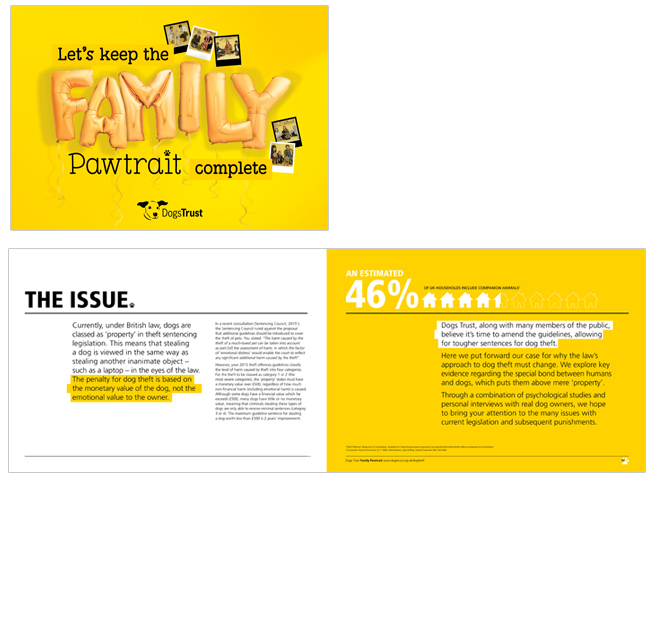
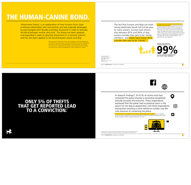
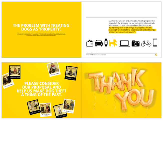
I also designed the proposal document that was submitted to the Sentencing Council. We figured that most proposals they receive are probably on the dry side, so we sent them an eye-catching, engaging proposal that was full of heart-warming stories.
By admin
On 04, Sep 2012 | In Digital Illustration Motion | By admin
Hyperoptic – Social Animations

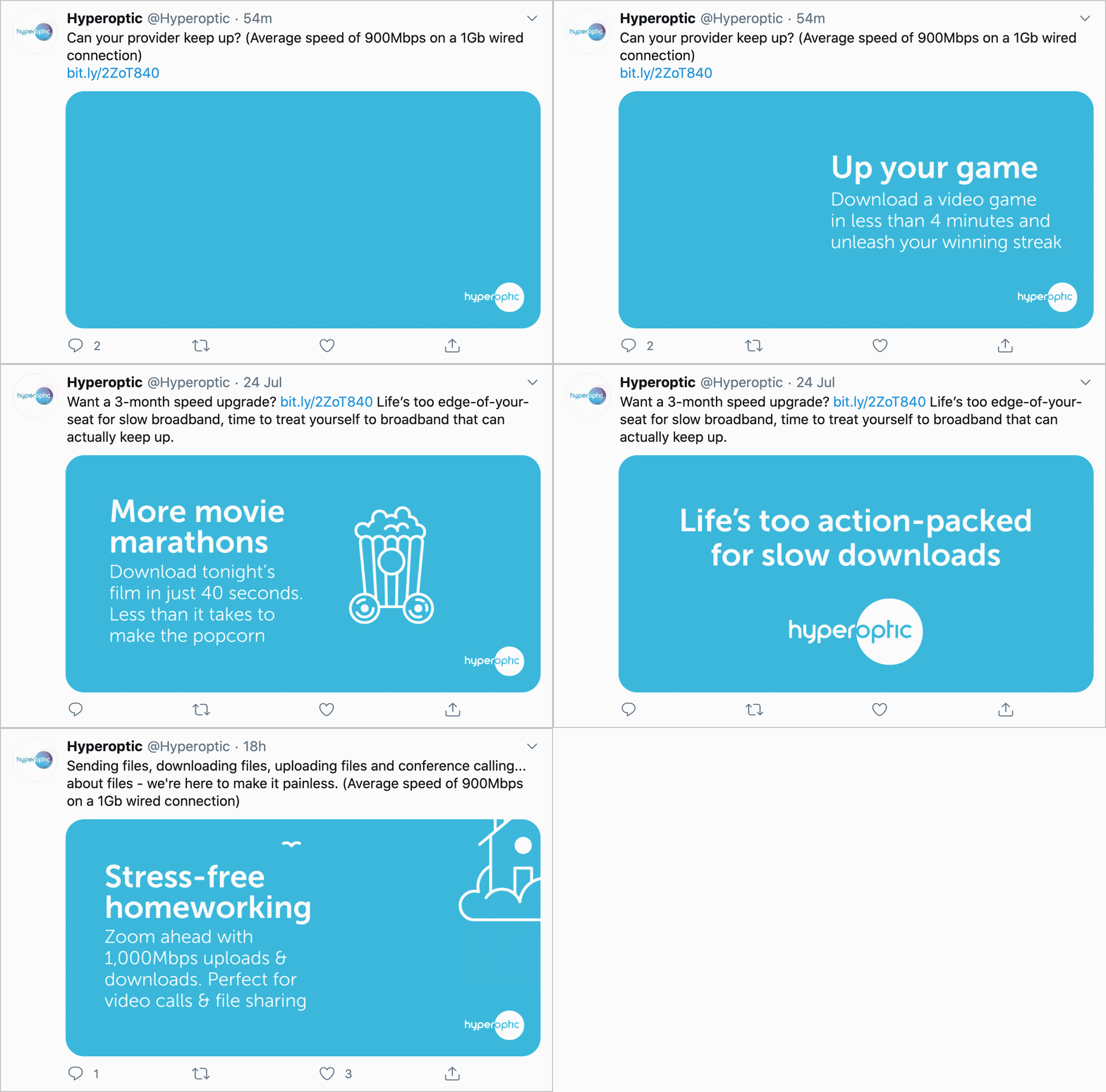
What would you do with really fast broadband? From downloading a movie in 40 seconds, to working, teaching and socialising from home during lockdown, Hyperoptic wanted a series of icons to bring to life the different things you can do with their super-speedy, full fibre broadband.
I designed a playful set of icons with their own little personalities. Each one is in motion in an unexpected, quirky way. A bucket of popcorn that whizzes past on wheels. Or a games console with wings. A little bit of fun while still looking… icon-y.
SOW Sussex – Branding

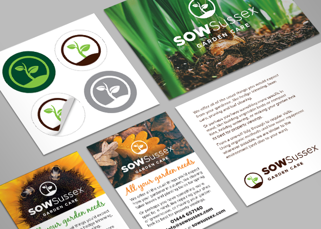
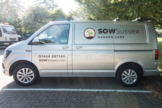
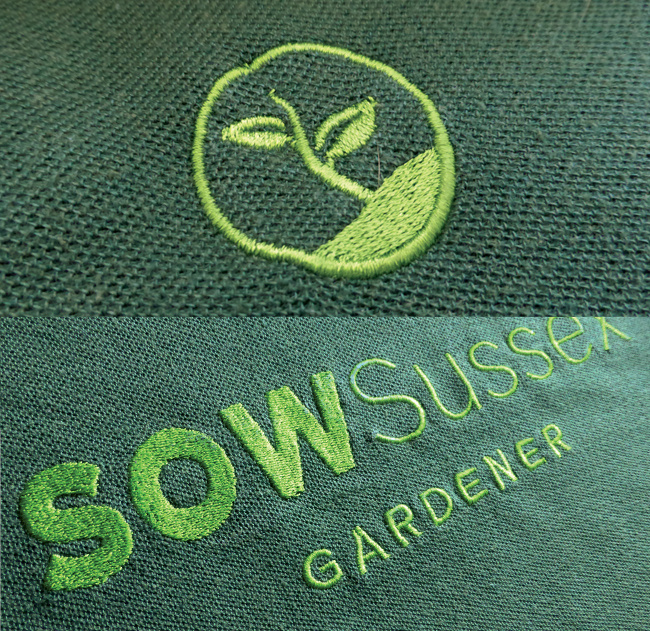
Branding design is just about my favourite thing to do. This was for my husband’s gardening business. With limited budget, we wanted to get as much personality as we could in to each deliverable. Every business card had a different image on the back, which made a nice conversation starter when giving them out. Customers could also take their pick from a choice of postcards. The logo had to work across various media, from being an icon on stickers, to being embroidered onto workwear. We also wrote everything ourselves, from press and facebook ads to the website itself – sowsussex.com
The business went from start up to full up in 18 months. I’d like to think that’s because of my logo design, but I suspect it’s actually down to my husband’s hard graft.
By admin
On 04, Sep 2012 | In Digital | By admin
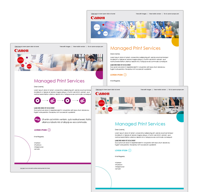
Canon – Managed Print Services

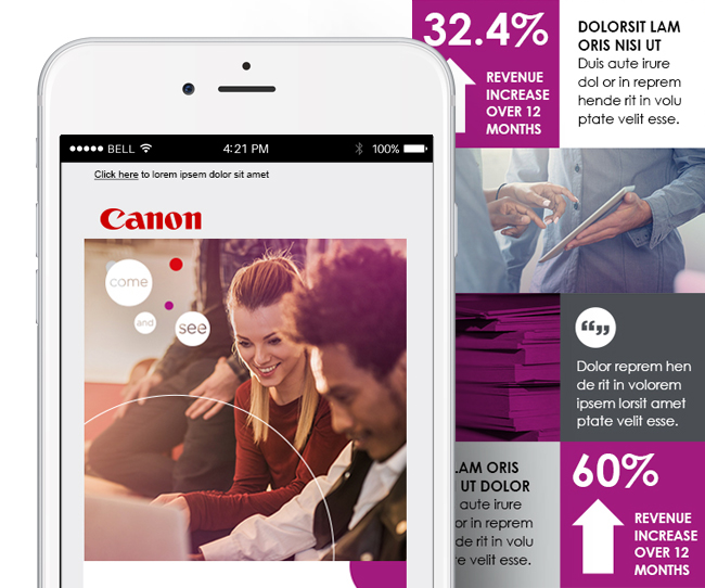
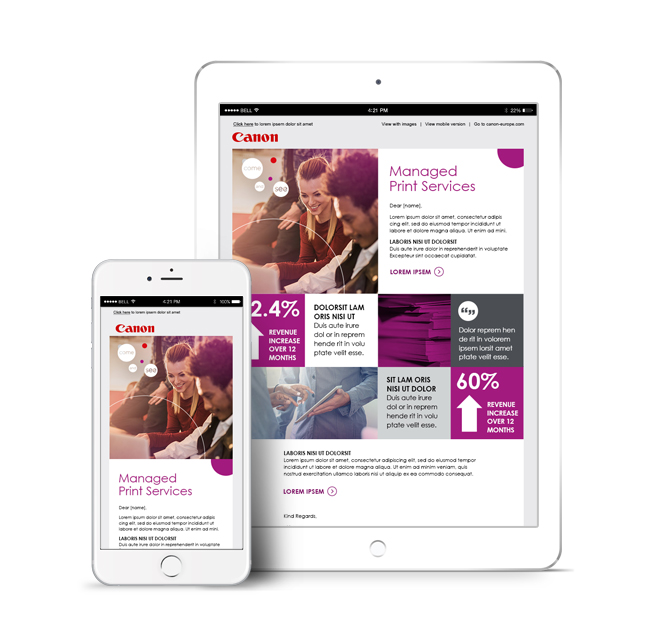
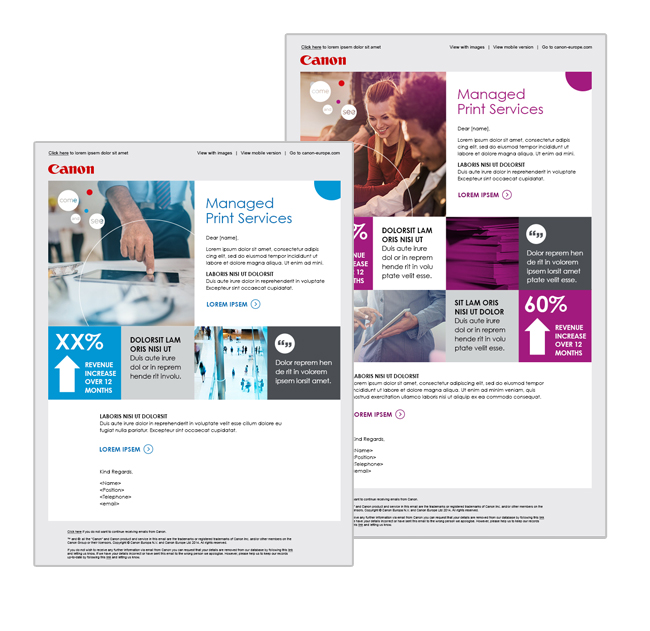
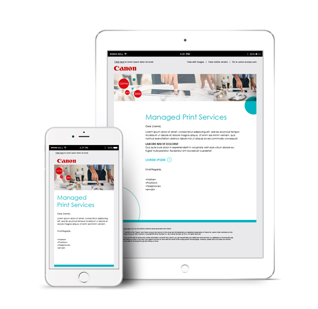
Canon’s Managed Print Service offers faster printing processes, more efficient workflows and ongoing optimisation of their customers’ print environment. They wanted a flexible design template for a series of emails going out to potential MPS customers. The first design option you see here used a modular template to accommodate pull-out stats and quotes to highlight the various benefits and glowing reviews from people who already used the service. The second design uses existing Canon imagery to create a bit of interest in the header, incorporating the pull-out info within the body of the email. With both design options, I used different colourways and imagery to make each new email in the series look fresh and different from the previous one. All emails were designed to be responsive.
By admin
On 04, Sep 2012 | In Digital Illustration | By admin
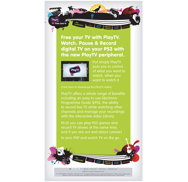
Sony Playstation – Play TV

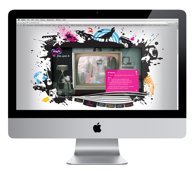
Play TV allows consumers to watch, pause and record digital television on their PS3, or watch it on the move on a PSP. The client had a series of individual vector icons that had been used on the packaging, and they needed a look and feel for the website that tied in with this. The homepage had to house the nav bar, as well as a border of some sort to hold a series of video clips.
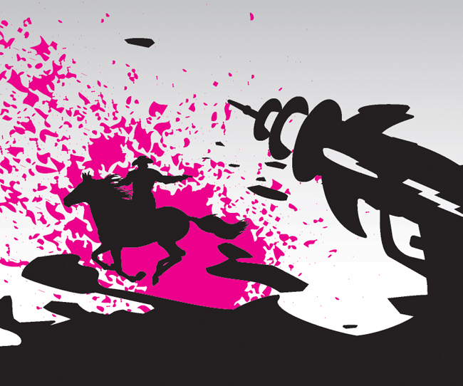
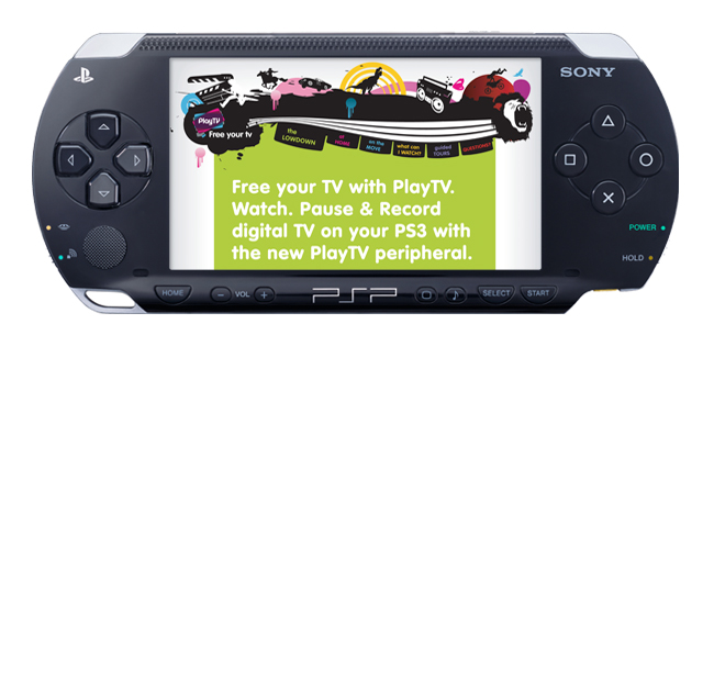
I liked the idea of a border that wasn’t a border, more of an explosion of the characters and freedom that Play TV offers. From the homepage look and feel, I designed a PSP email.
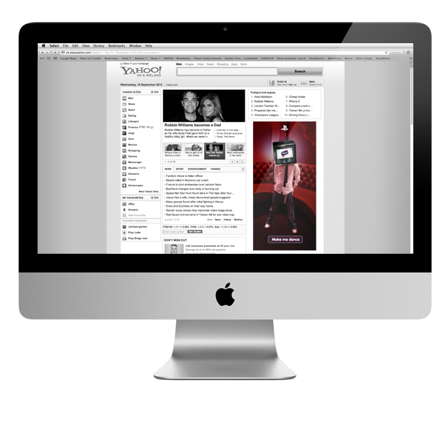
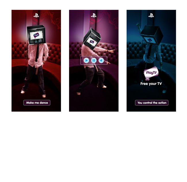
I also created a half page online ad, featuring the TV-head character from the website. The user could control his movements and make him dance, before being redirected to the site.
By admin
On 04, Sep 2012 | In Digital | By admin
Canon – Thought Leadership Programme

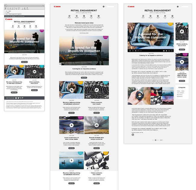
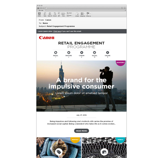
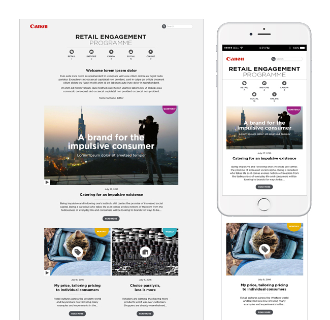
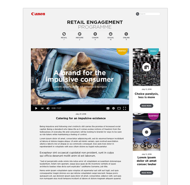
An internal website directory of articles to engage staff at Canon and promote discussion and interaction. I designed the initial email that went to staff, the homepage for the website, as well as what an individual article would look like if they clicked through to read it.
Some articles were written to be a quick lunchtime glance, while others were a more in-depth read. I had to consider this, along with categorisation by subject matter when designing the icons and navigation for the site. All elements were designed to be responsive.
No Comments
By admin
On 04, Sep 2012 | No Comments | In Brand Digital Logo Pitch | By admin
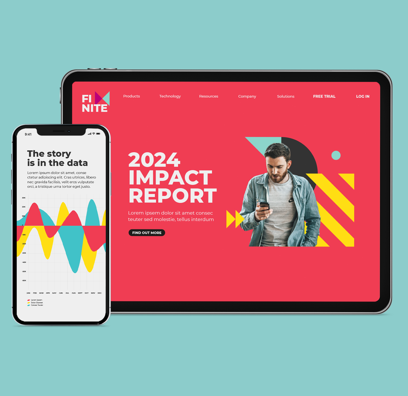
FiNite – Brand Development

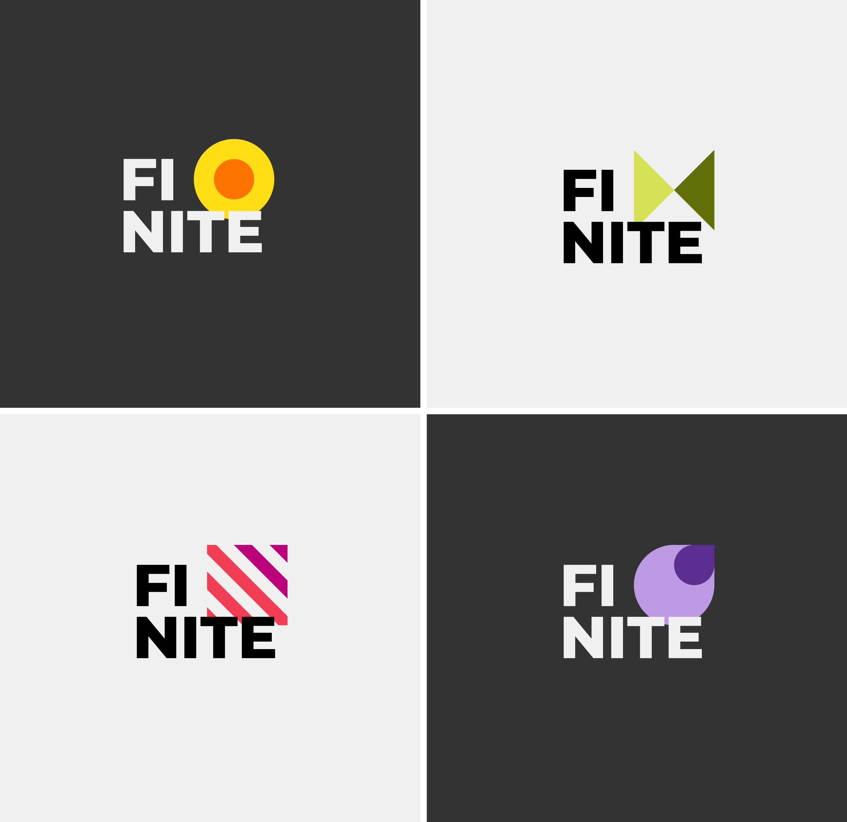
Pitch to rebrand a company that transforms media data into measurable, actionable insights for brands, enabling smarter interactions with consumers.
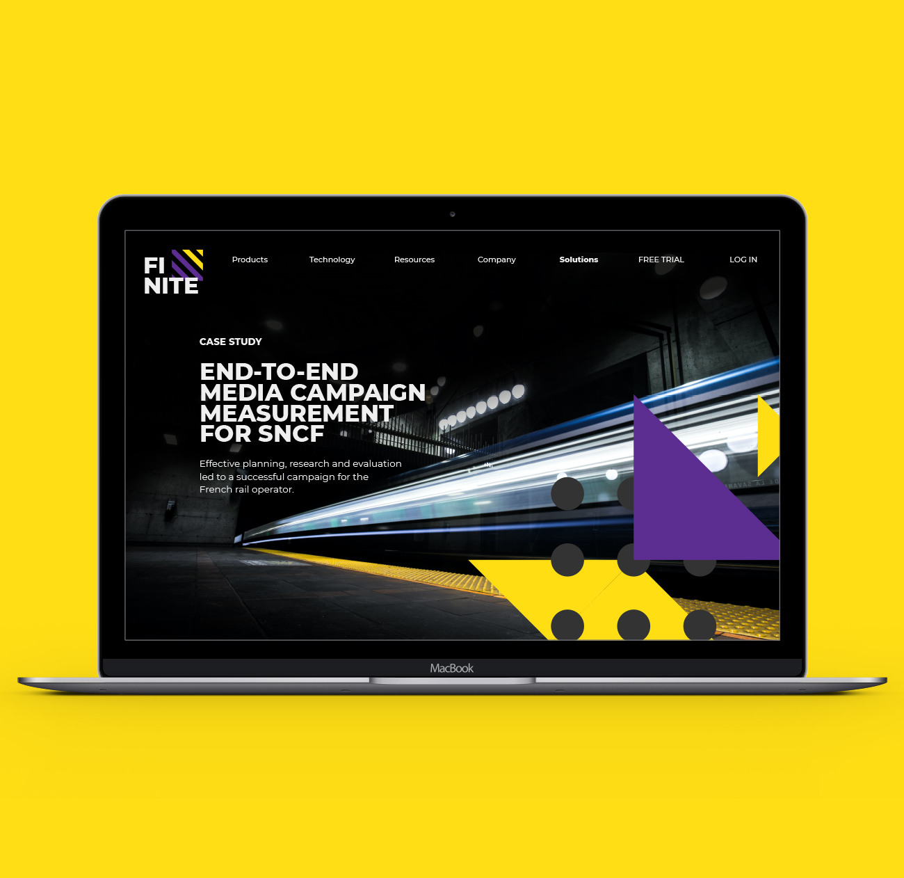
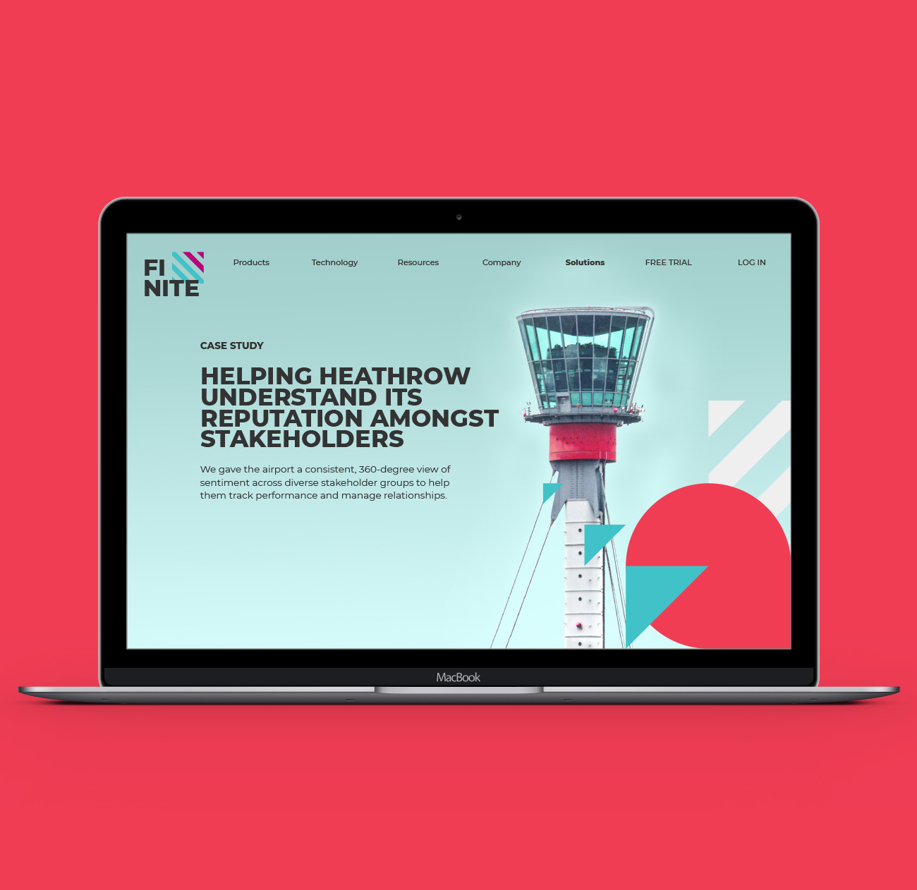
I developed a graphic ‘kit of parts’ using the simplest, most elemental shapes to represent the fragmented nature of data.
These shapes became a foundation for the look & feel, coming together in a series of flexible patterns which could be overlaid onto full bleed imagery for a case study page on the website, while also working to hold cutout images against a solid background colour.
For the pitch, we presented the brand look & feel exploration and rolled it out across responsive website design, email and social posts.
By admin
On 04, Sep 2012 | In Digital Illustration Motion | By admin
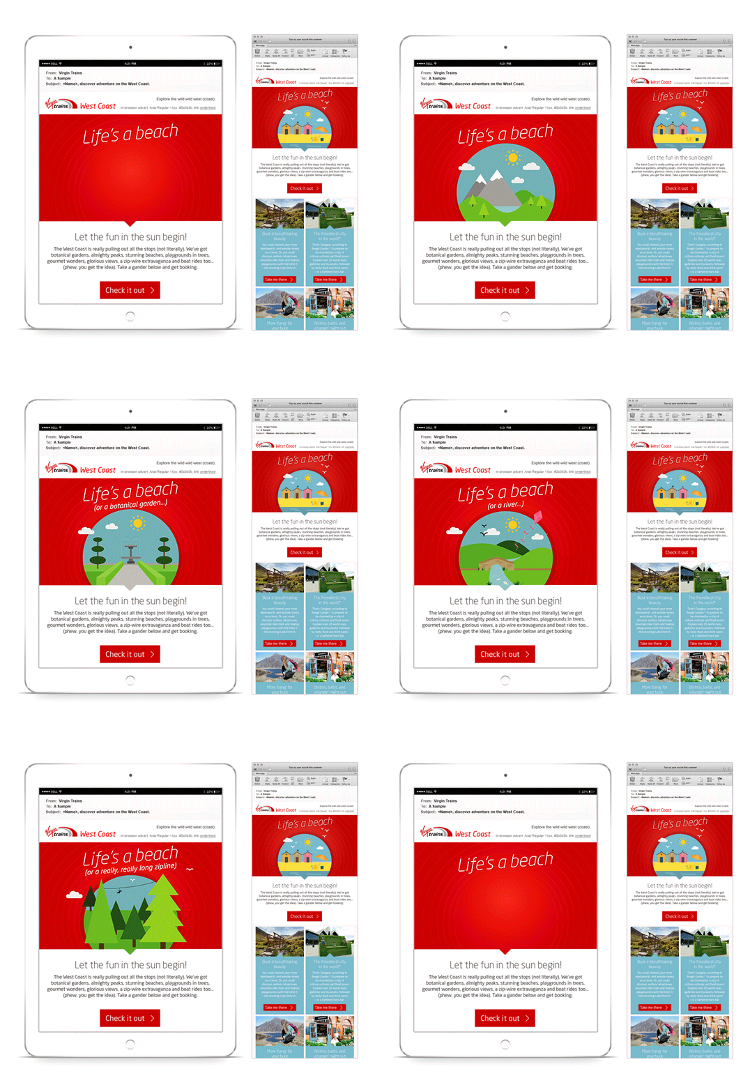
Virgin Trains – Destination Inspiration

Always in a rush to undersell myself, I can’t draw freehand to save my life! But I thoroughly enjoyed this little bit of vector fun for Virgin Trains. They wanted to get customers planning their next train adventure with a ‘destination inspiration’ email. Virgin’s TOV for these emails is fun and a little tongue-in-cheek, and I tried to achieve that with the playful animated illustrations in the email header.
By admin
On 04, Sep 2012 | In Digital | By admin
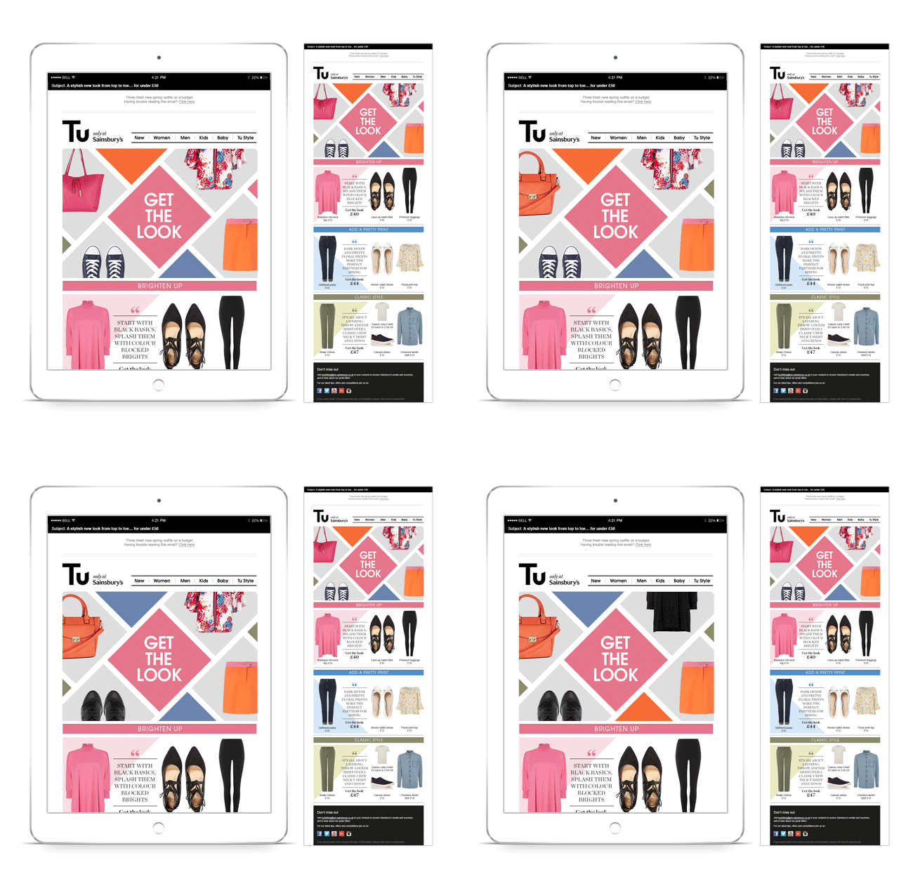
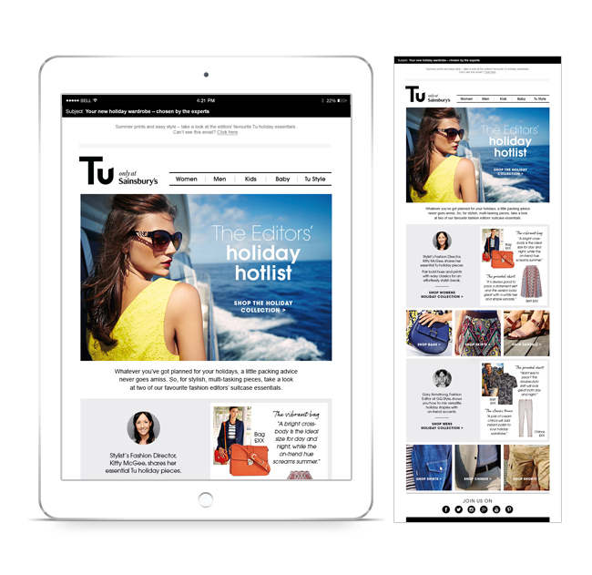
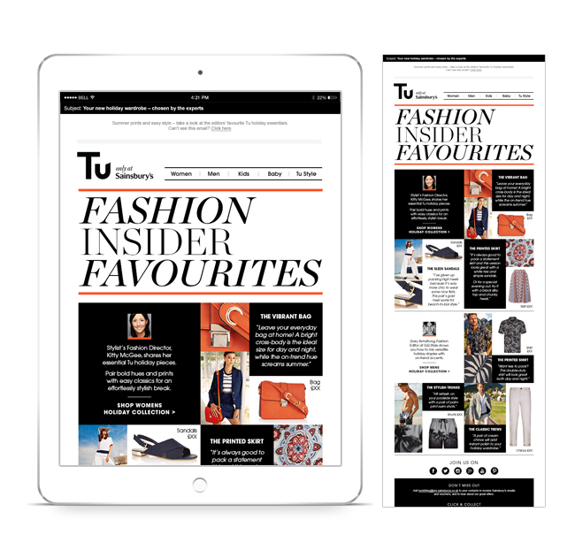
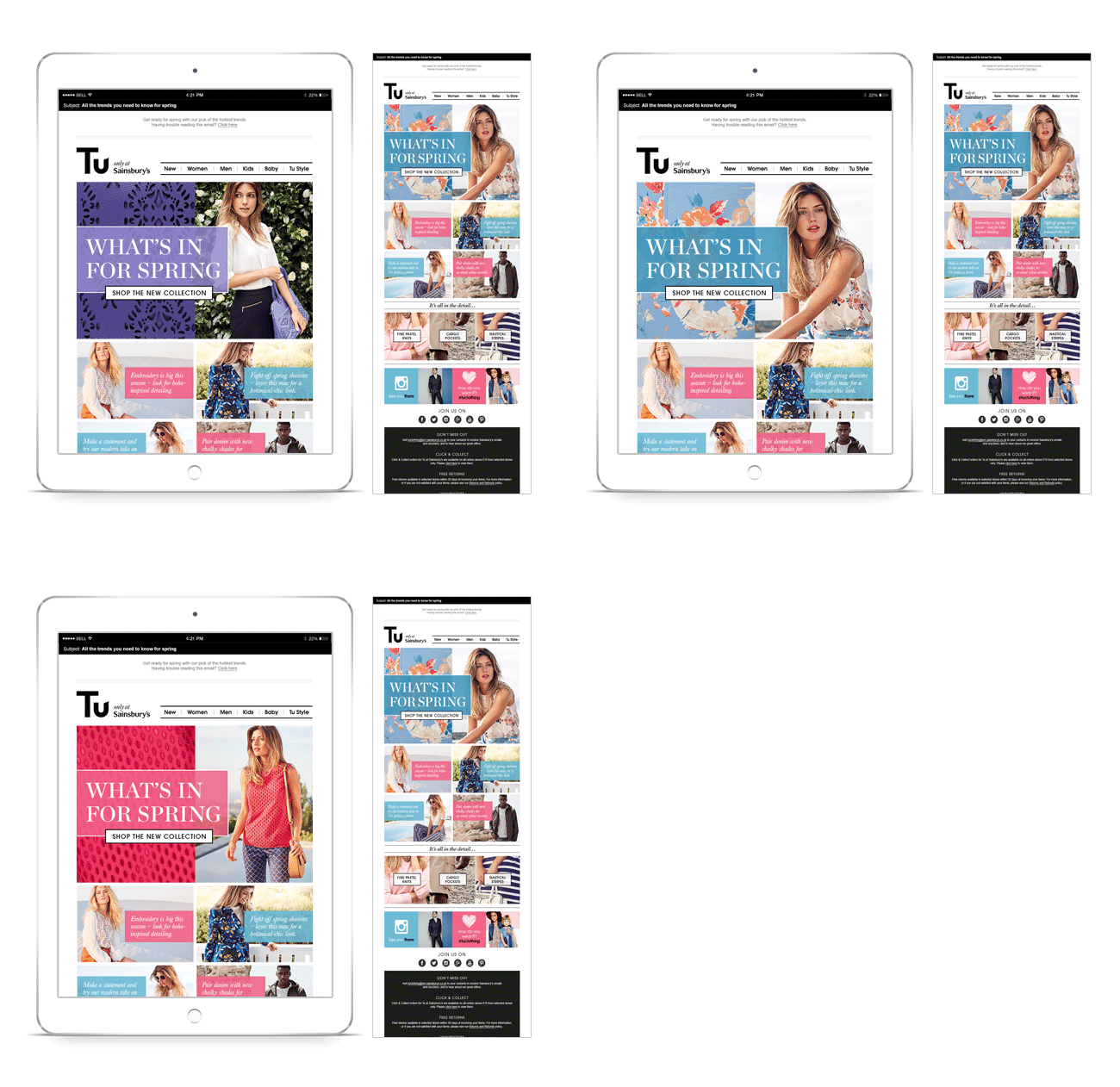
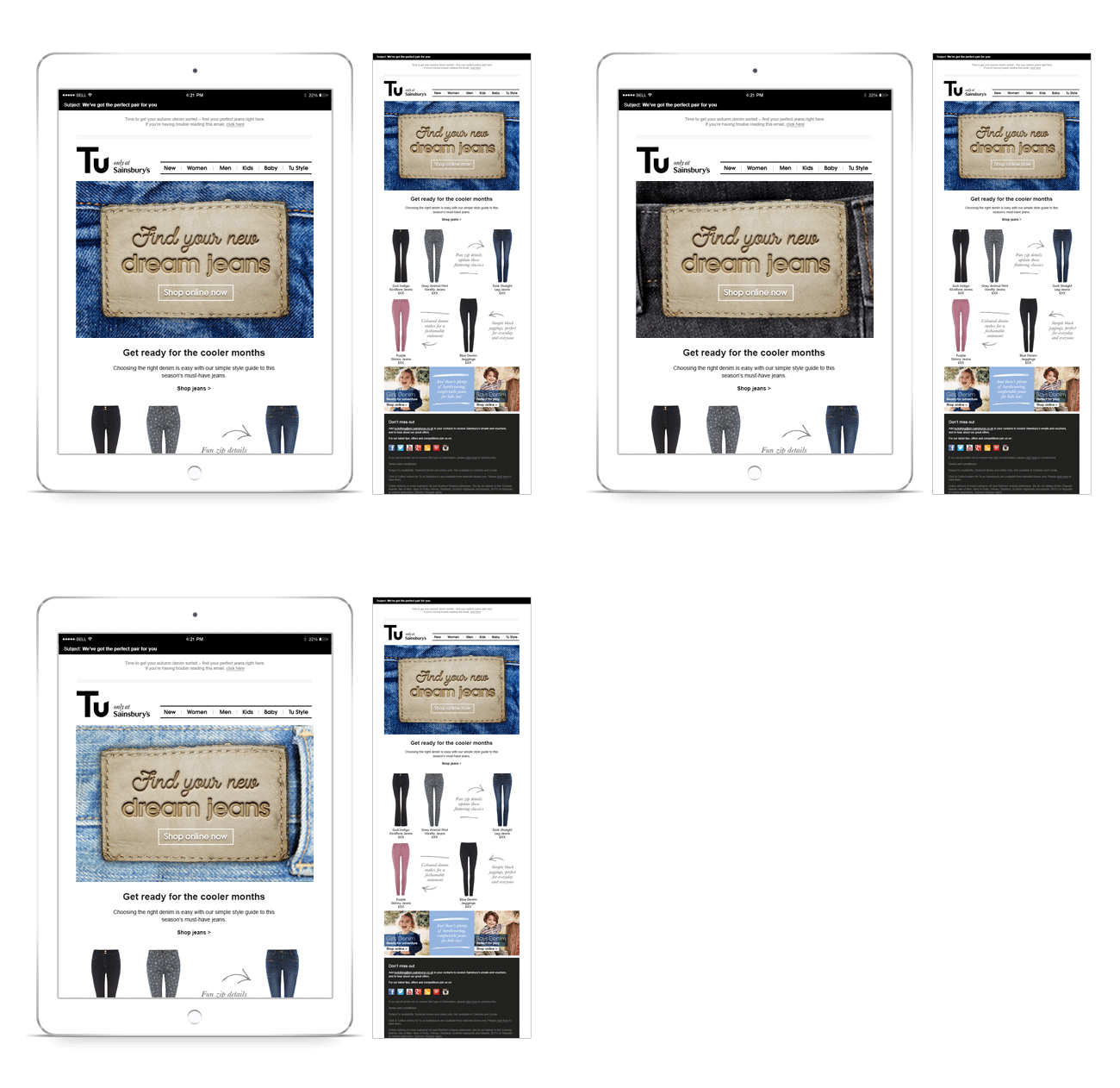
Sainsbury’s Tu – Emails

A variety of emails for Sainsbury’s fashion brand, Tu. Weekly emails encouraged customers to visit the newly-launched Tu website where they could shop online for the whole family, as well as read advice and tips from influencers and magazine editors in the ‘Tu Style’ section. Designed using a flexible editorial-type template, each email conveyed a different message. Briefs might include a new collection launch with key pieces selected by stylist Gok Wan, holiday outfit solutions or the ultimate denim fit guide. All emails were designed to be responsive, and I used a bit of basic Photoshop animation in the header where possible to bring the idea to life.


