My Projects
By admin
On 04, Sep 2012 | In Illustration Typography | By admin
BlackBerry – Set Your Social Life Free

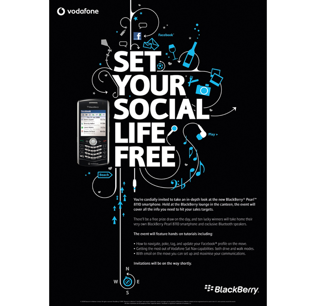
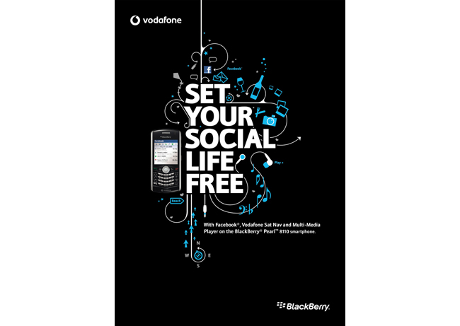
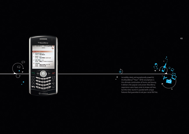
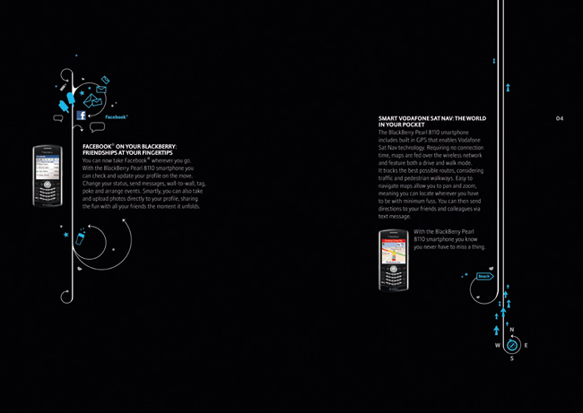
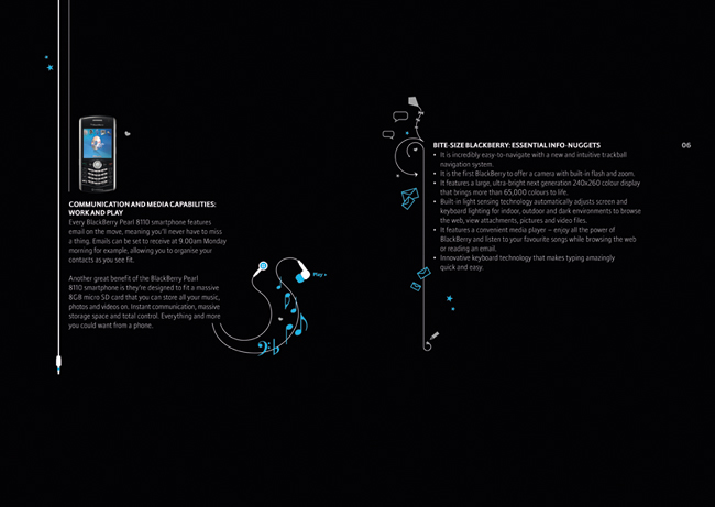
An event to coincide with the launch of the BlackBerry Pearl smartphone. The handset embraced social media, had built in sat nav and it was the first BlackBerry to offer a camera with both flash and zoom. These benefits combined to make it a great tool for leisure, and not just the brand’s traditional business users.
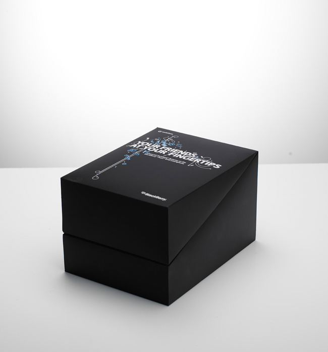
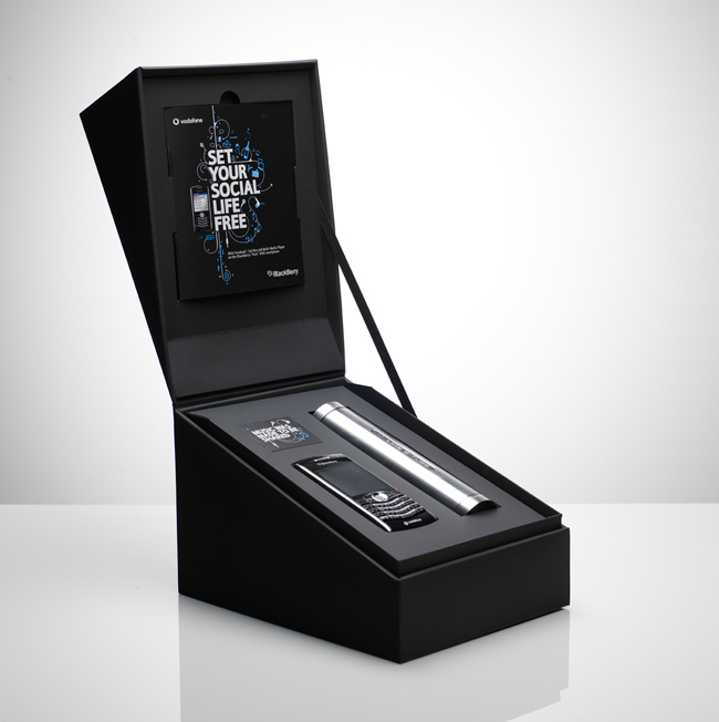
I designed a series of icons to illustrate the different benefits of the phone, and a hero headline. We created a poster, leaflet and pull-up banner for the launch. And a lucky 100 recipients were sent a box that promised to ‘Set Your Social Life Free’, with their own handset and speaker. We worked closely with the printer to ensure that the box had a premium feel, with a black, satin card construction and that the cables were hidden discreetly away in a bespoke compartment.
By admin
On 04, Sep 2012 | In Illustration Press Typography | By admin
Honda – ATV

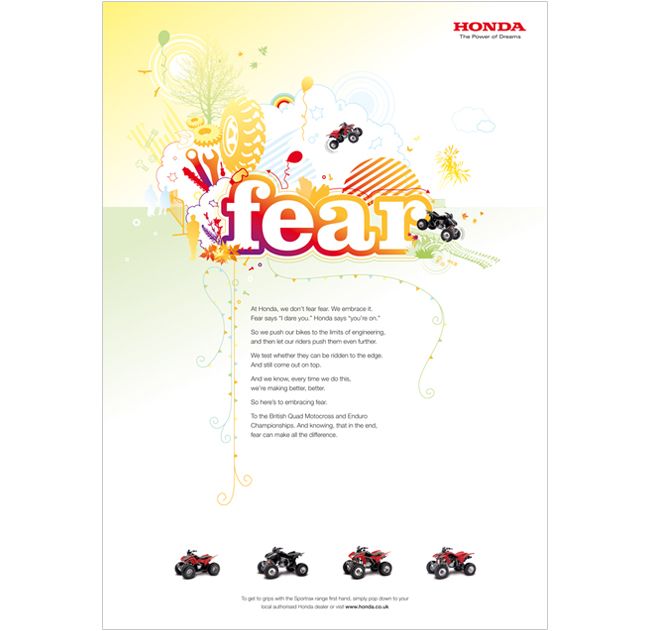
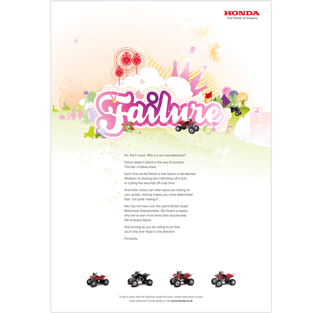
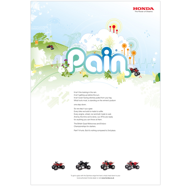
Press campaign to create awareness of Honda’s range of sports ATVs.
Soichiro Honda is quoted as saying that success is 99% failure. Our long copy ‘poems’ explain that Honda embraces the fear you feel before a race, and they turn it into a positive energy to help them win. We turned the negative words associated with failure into bright, fun illustrations to be celebrated.
I created the look and feel for the campaign using the Fear and Failure ads. I then oversaw my junior designer at the time, as he created the Almost and Pain executions.
The campaign won silver for press at the DMA awards 2008.
By admin
On 04, Sep 2012 | In Digital Illustration Motion | By admin
Hyperoptic – Social Animations

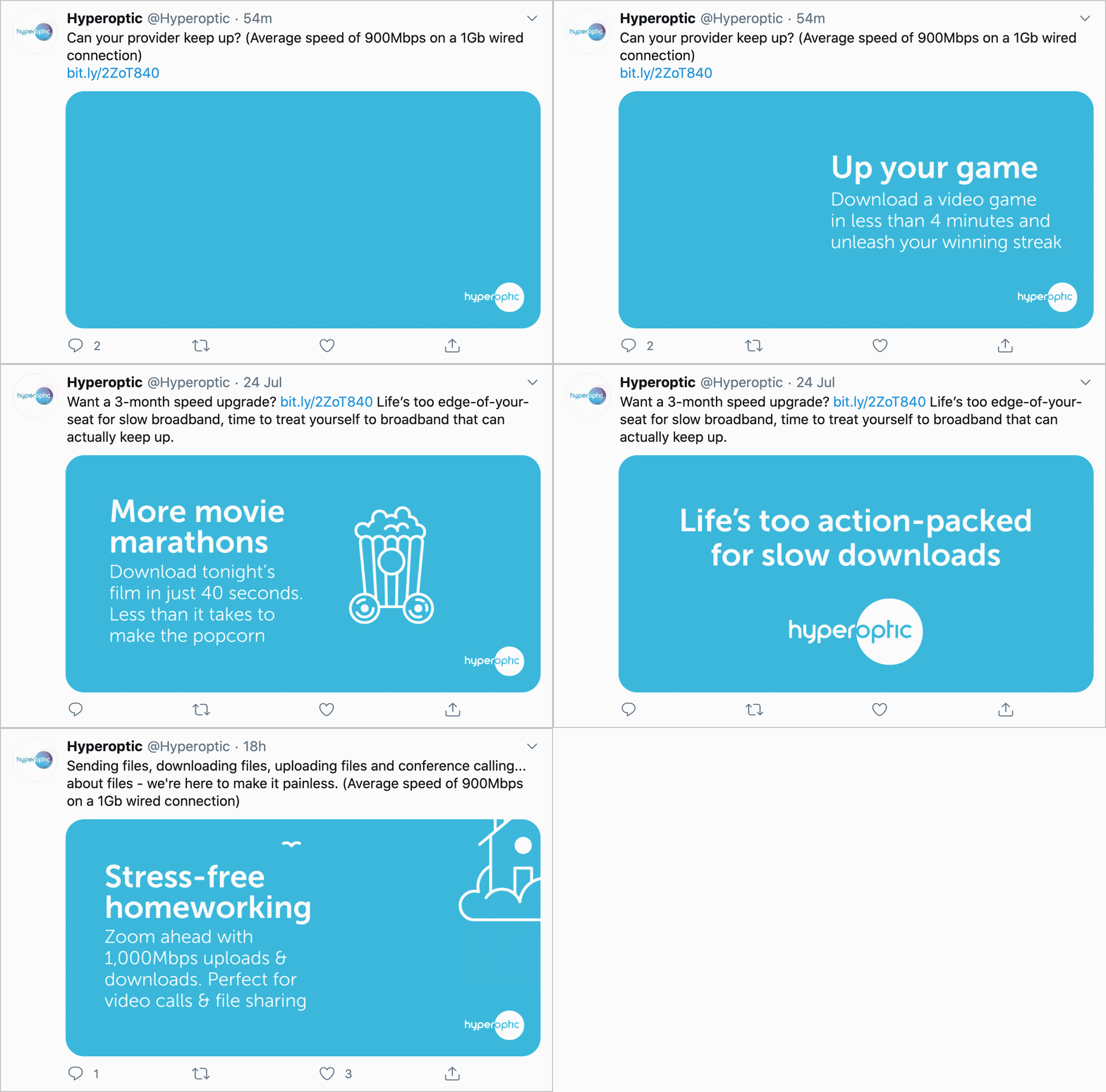
What would you do with really fast broadband? From downloading a movie in 40 seconds, to working, teaching and socialising from home during lockdown, Hyperoptic wanted a series of icons to bring to life the different things you can do with their super-speedy, full fibre broadband.
I designed a playful set of icons with their own little personalities. Each one is in motion in an unexpected, quirky way. A bucket of popcorn that whizzes past on wheels. Or a games console with wings. A little bit of fun while still looking… icon-y.
By admin
On 04, Sep 2012 | In DM Illustration | By admin
Honda – Emergency Services

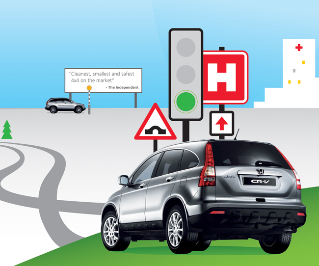
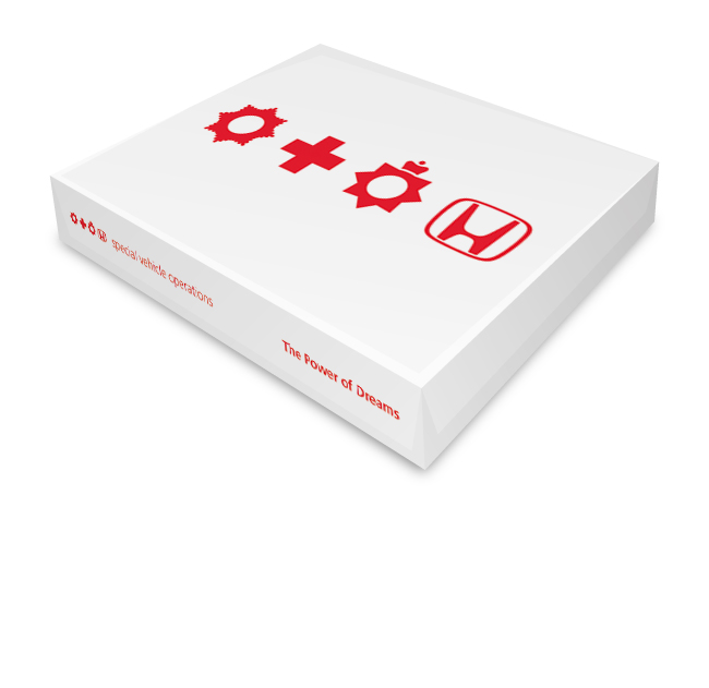
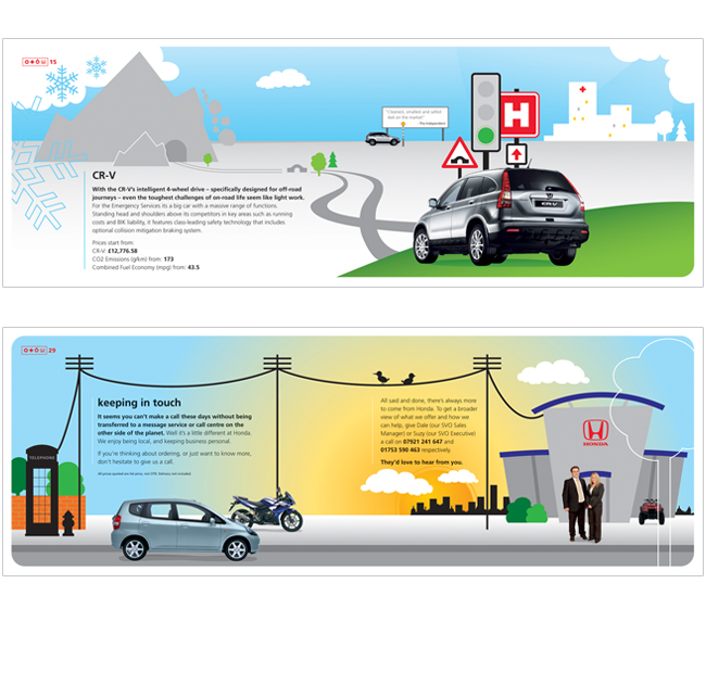
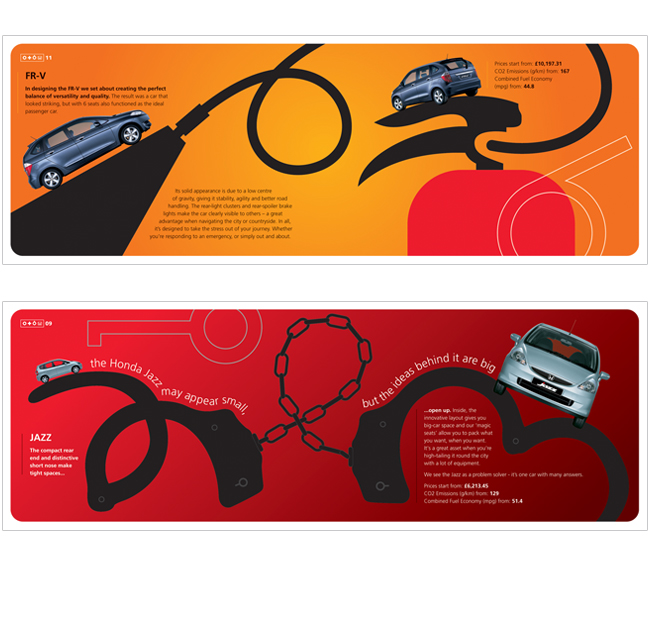
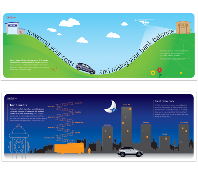
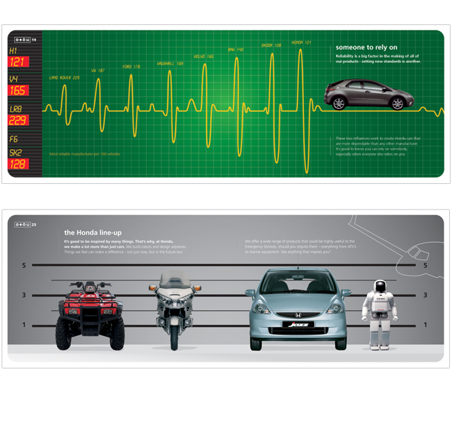
Honda’s Special Vehicle Operations team supplies tailored cars and motorbikes to the emergency services. They wanted a stand-out DM piece that would be kept somewhere visible for future reference by the fleet managers.
Honda is renowned for it’s fun, irreverent personality. We created a series of simplistic, charming illustrations that communicated the key benefits of choosing Honda’s fleet vehicles.
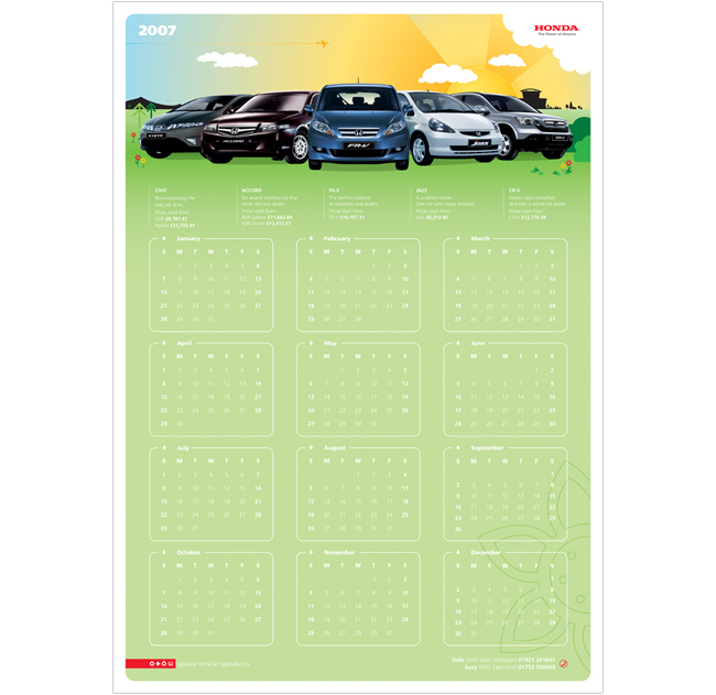
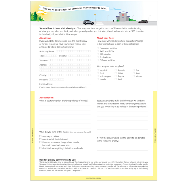
A wall chart calendar kept Honda front-of-mind for the year and a lighthearted illustration made even the questionnaire in the pack look exciting!
By admin
On 04, Sep 2012 | In Digital Illustration | By admin
Sony Playstation – Play TV

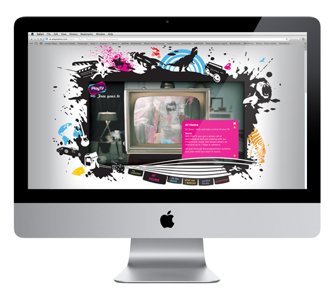
Play TV allows consumers to watch, pause and record digital television on their PS3, or watch it on the move on a PSP. The client had a series of individual vector icons that had been used on the packaging, and they needed a look and feel for the website that tied in with this. The homepage had to house the nav bar, as well as a border of some sort to hold a series of video clips.
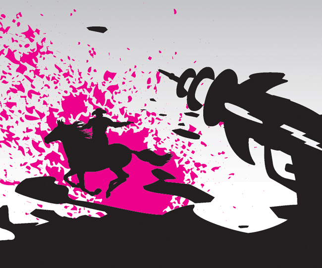
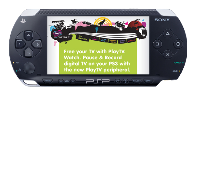
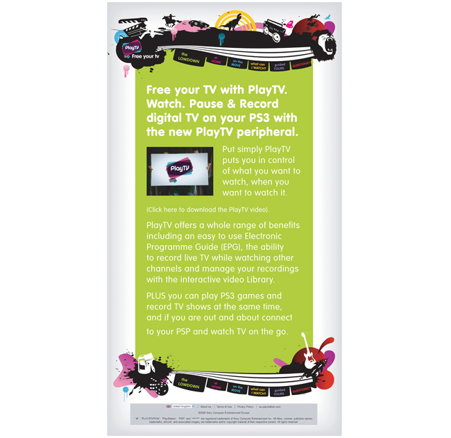
I liked the idea of a border that wasn’t a border, more of an explosion of the characters and freedom that Play TV offers. From the homepage look and feel, I designed a PSP email.
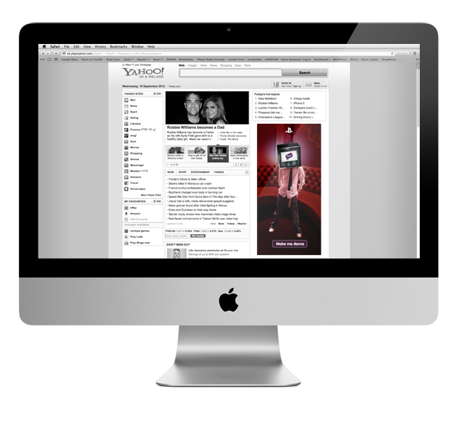
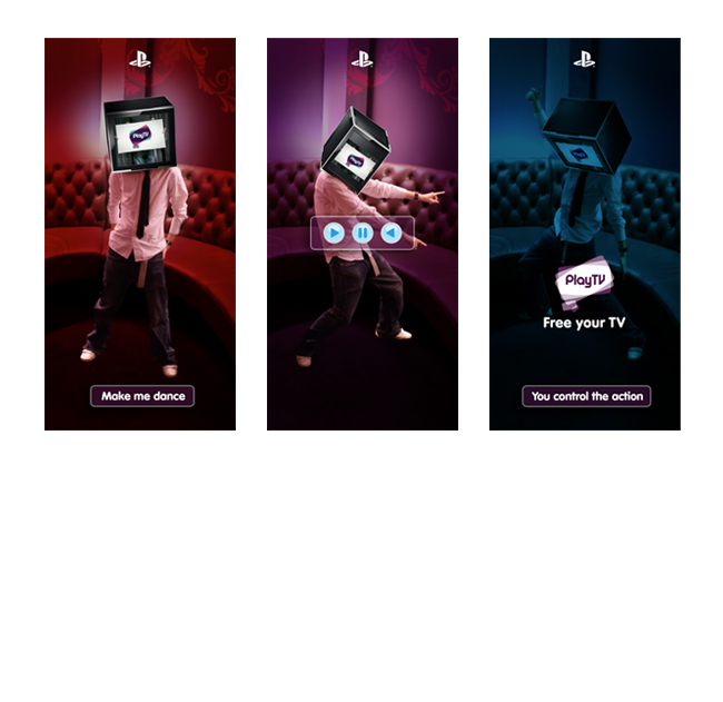
I also created a half page online ad, featuring the TV-head character from the website. The user could control his movements and make him dance, before being redirected to the site.
By admin
On 04, Sep 2012 | In Digital Illustration Motion | By admin
Virgin Trains – Destination Inspiration

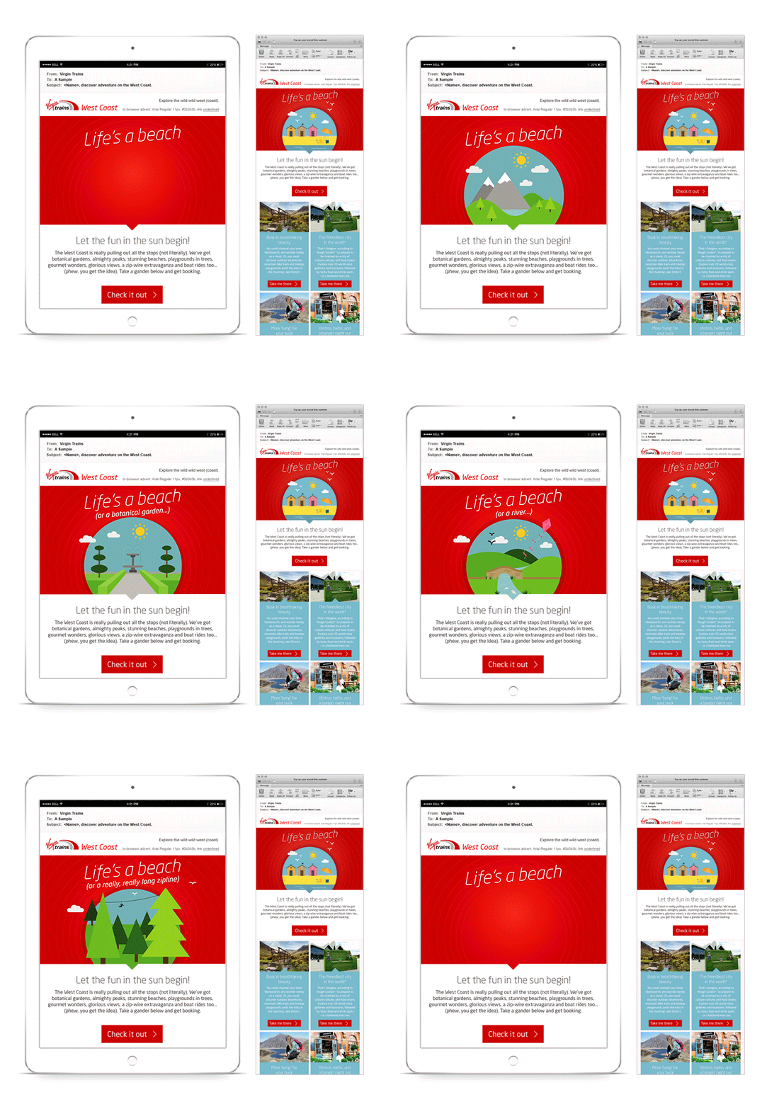
Always in a rush to undersell myself, I can’t draw freehand to save my life! But I thoroughly enjoyed this little bit of vector fun for Virgin Trains. They wanted to get customers planning their next train adventure with a ‘destination inspiration’ email. Virgin’s TOV for these emails is fun and a little tongue-in-cheek, and I tried to achieve that with the playful animated illustrations in the email header.


