My Projects
SOW Sussex – Branding

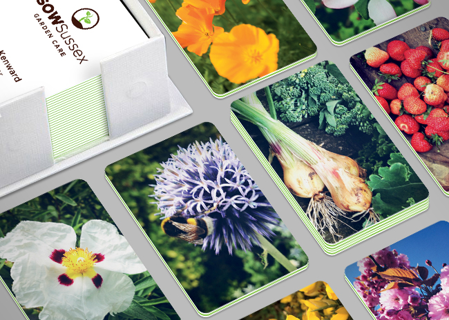
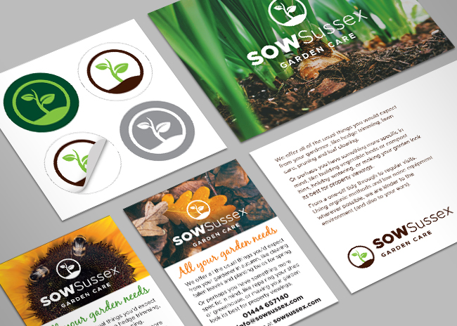
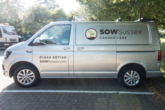
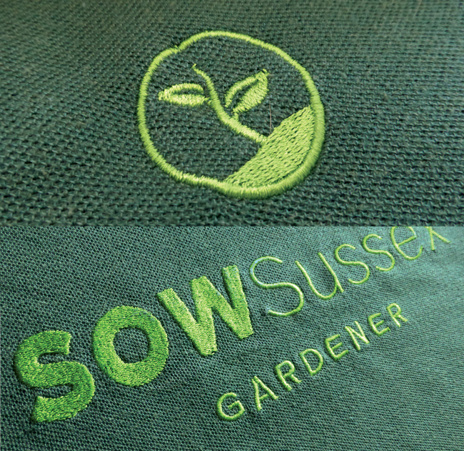
Branding design is just about my favourite thing to do. This was for my husband’s gardening business. With limited budget, we wanted to get as much personality as we could in to each deliverable. Every business card had a different image on the back, which made a nice conversation starter when giving them out. Customers could also take their pick from a choice of postcards. The logo had to work across various media, from being an icon on stickers, to being embroidered onto workwear. We also wrote everything ourselves, from press and facebook ads to the website itself – sowsussex.com
The business went from start up to full up in 18 months. I’d like to think that’s because of my logo design, but I suspect it’s actually down to my husband’s hard graft.
No Comments
By admin
On 04, Sep 2012 | No Comments | In Brand Digital Logo Pitch | By admin
FiNite – Brand Development

Pitch to rebrand a company that transforms media data into measurable, actionable insights for brands, enabling smarter interactions with consumers.
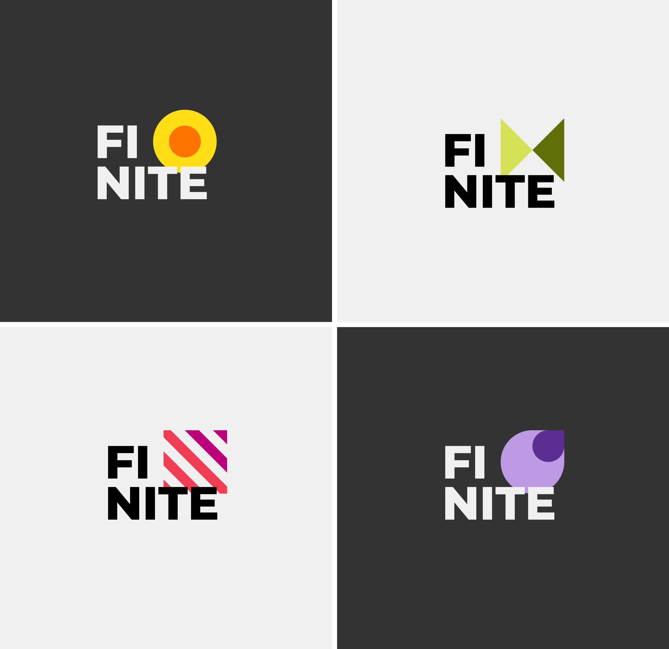
I developed a graphic ‘kit of parts’ using the simplest, most elemental shapes to represent the fragmented nature of data.
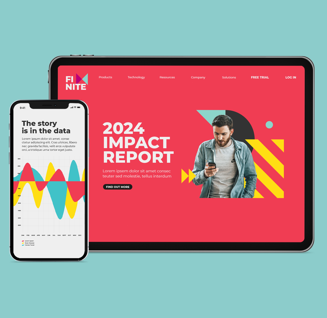
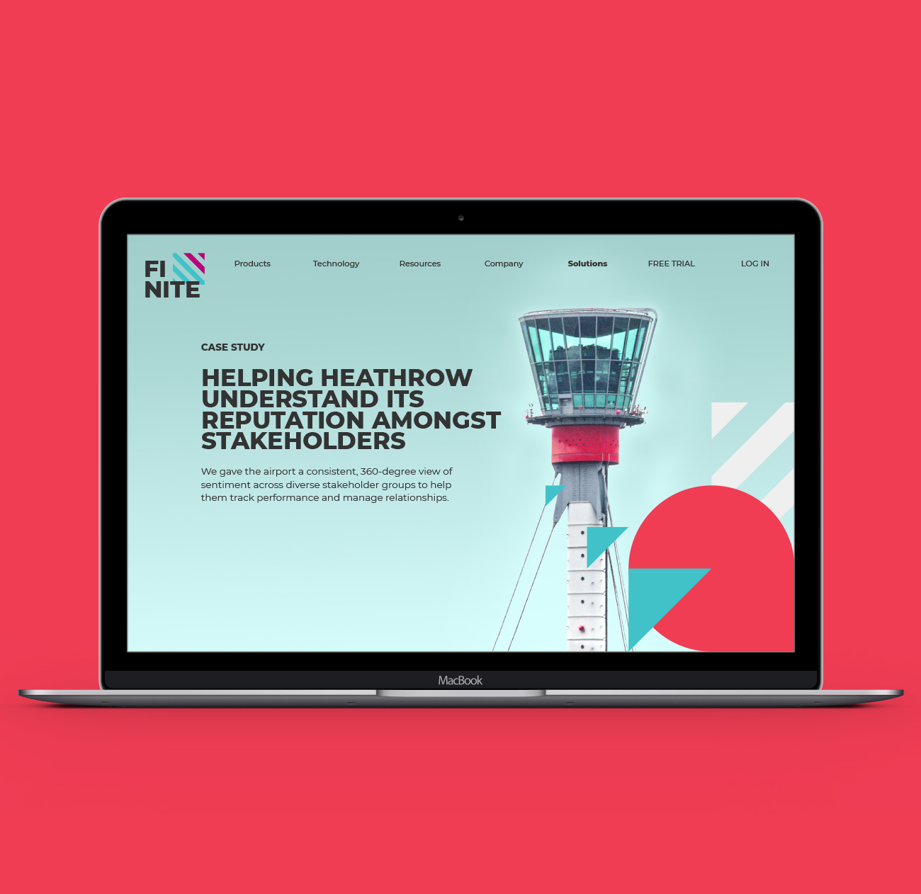
These shapes became a foundation for the look & feel, coming together in a series of flexible patterns which could be overlaid onto full bleed imagery for a case study page on the website, while also working to hold cutout images against a solid background colour.
For the pitch, we presented the brand look & feel exploration and rolled it out across responsive website design, email and social posts.
By admin
On 04, Sep 2012 | In Brand Logo Pitch Typography | By admin
AEG – 125 Years

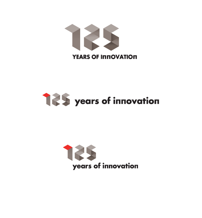
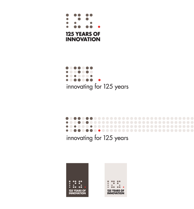
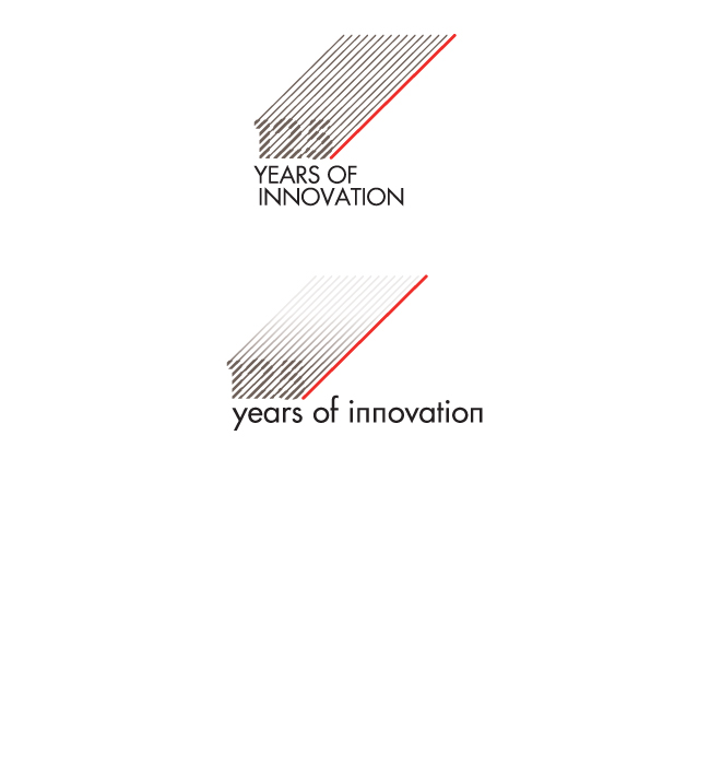
AEG is celebrating 125 years of precision engineering and innovative design. They wanted a logo that echoed these principles. The design needed to sit within the AEG brand look and feel with regard to colour scheme and font.
I developed three initial ideas, being influenced by the design details you might find on an AEG appliance – the dot matrix time display being one example. For another route, I created a series of numbers based on a geometric grid.


