My Projects
By admin
On 04, Sep 2012 | In ATL Pitch Typography | By admin
Strongbow – Bowtime

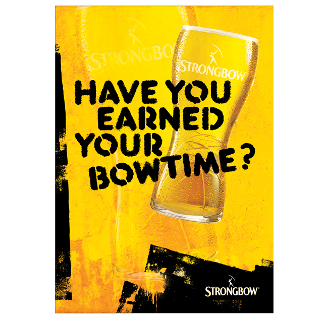
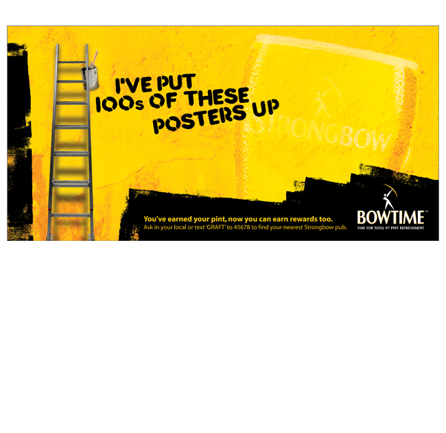
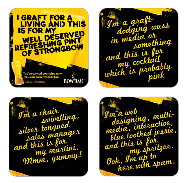
A BTL campaign to tie in with Strongbow’s ATL message of ‘Bowtime, Hard Earned’.
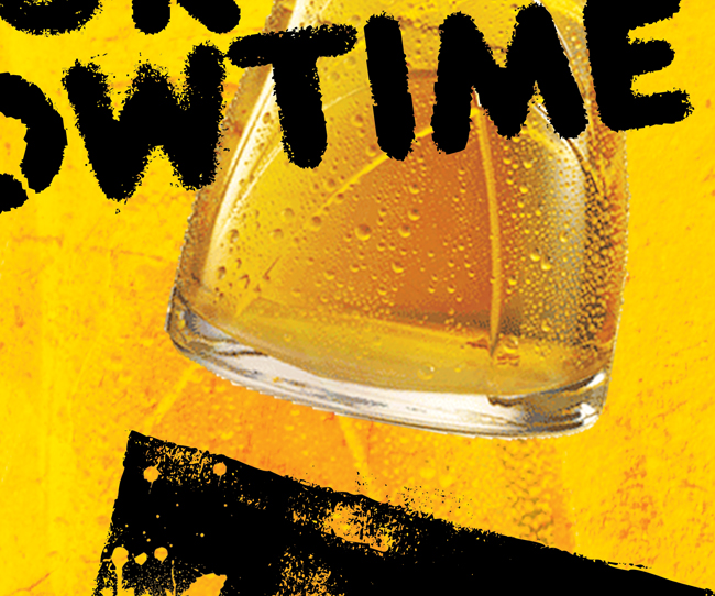
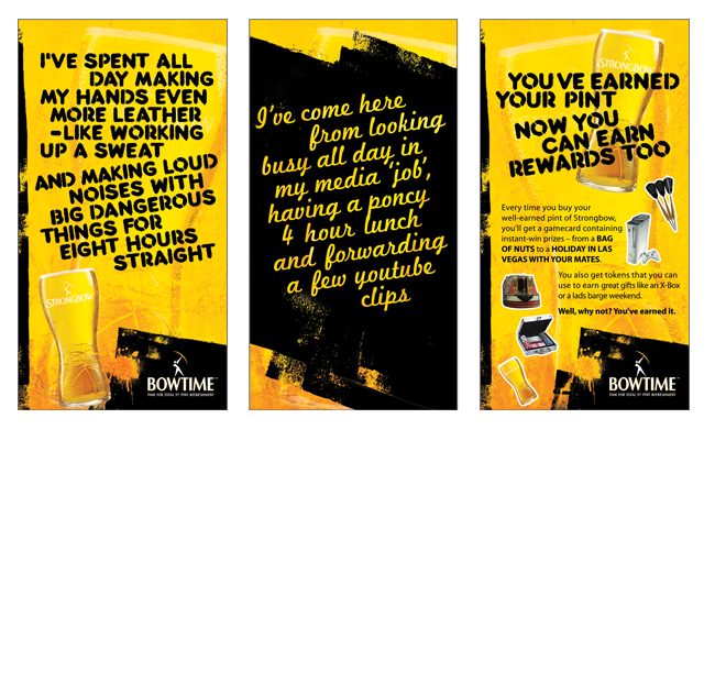
I layered the black roller marks from a hard-grafting painter and decorator over a mouth-watering close up shot of a pint of Strongbow. A rough, stencilled font gave us the honest voice of our Strongbow drinker, deserving a refreshing pint and a bit of Bowtime. And a pretty script font voiced the work-dodging sales manager who was probably drinking a pink cocktail.
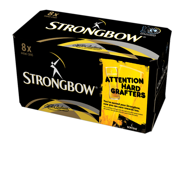
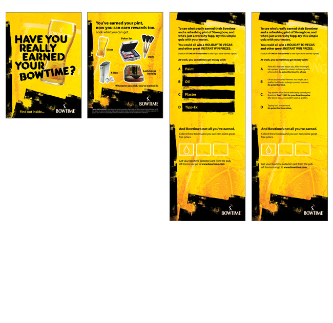
For the pitch, we rolled the campaign out over 6 sheets, 48 sheets, on-pack, beer mats, instant win game cards, tent cards…
No Comments
By admin
On 04, Sep 2012 | No Comments | In Brand Digital Logo Pitch | By admin
FiNite – Brand Development

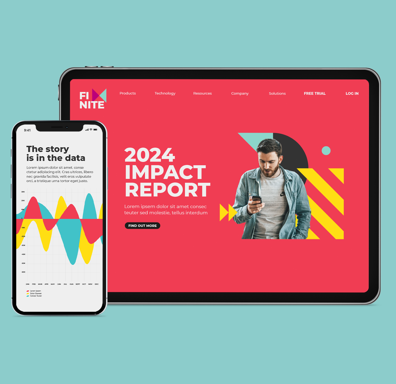
Pitch to rebrand a company that transforms media data into measurable, actionable insights for brands, enabling smarter interactions with consumers.
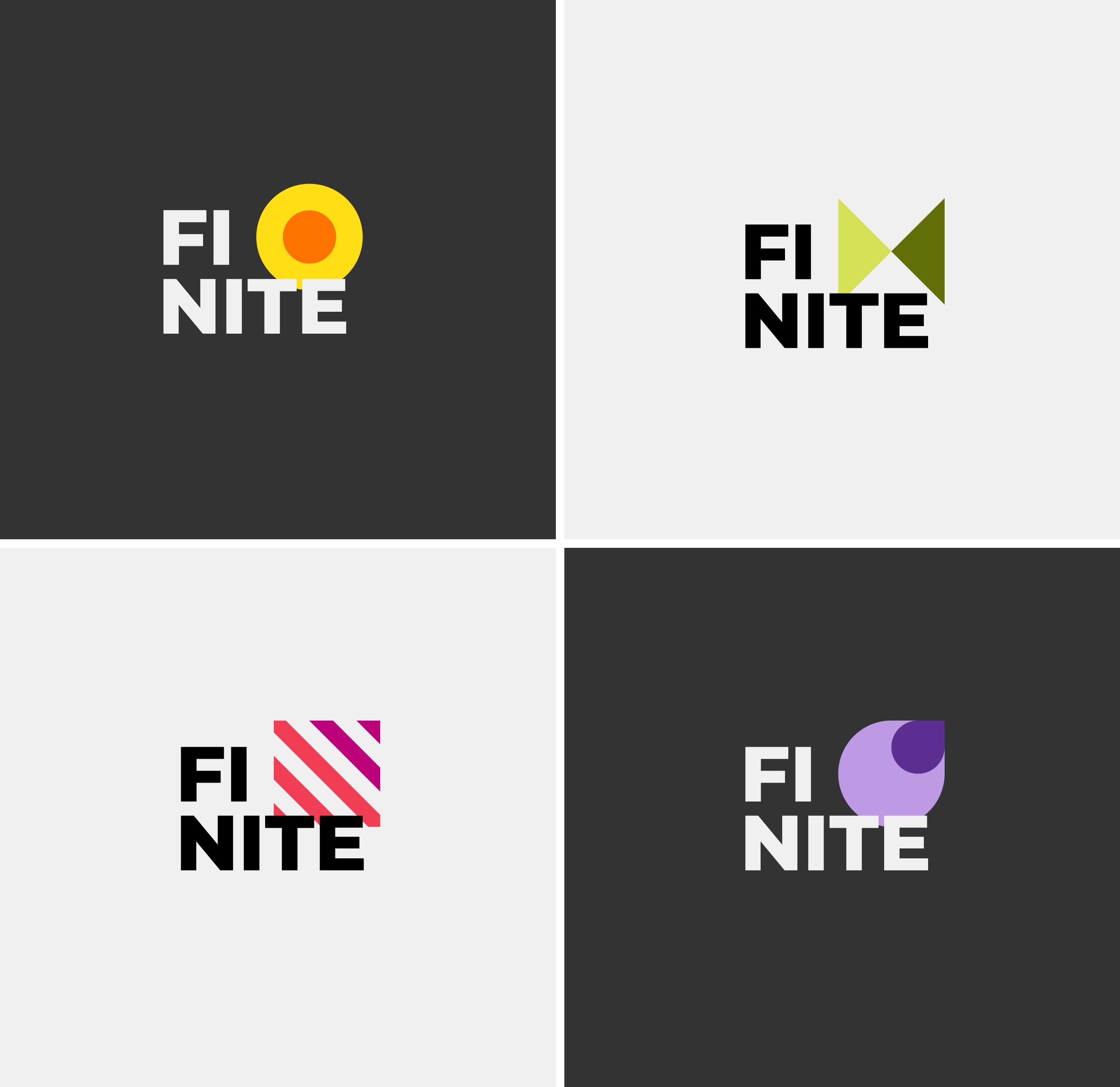
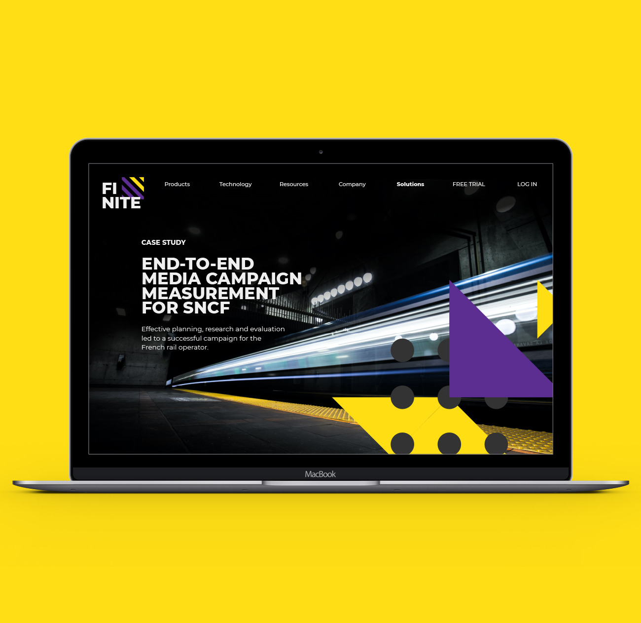
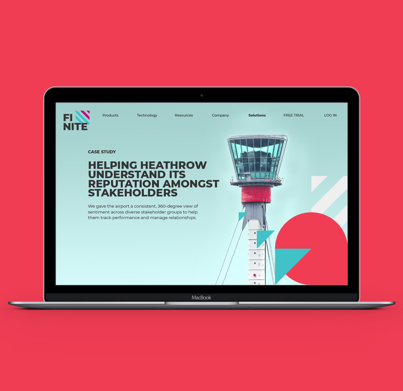
I developed a graphic ‘kit of parts’ using the simplest, most elemental shapes to represent the fragmented nature of data.
These shapes became a foundation for the look & feel, coming together in a series of flexible patterns which could be overlaid onto full bleed imagery for a case study page on the website, while also working to hold cutout images against a solid background colour.
For the pitch, we presented the brand look & feel exploration and rolled it out across responsive website design, email and social posts.
By admin
On 04, Sep 2012 | In Brand Logo Pitch Typography | By admin
AEG – 125 Years

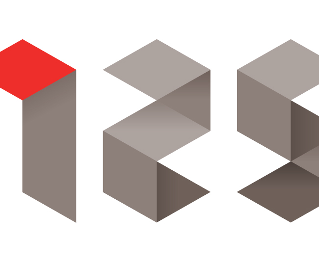
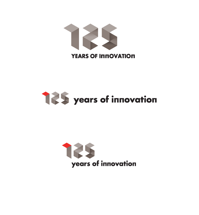
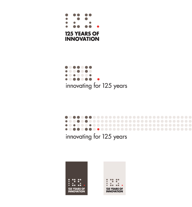
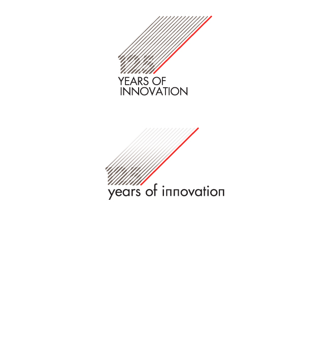
AEG is celebrating 125 years of precision engineering and innovative design. They wanted a logo that echoed these principles. The design needed to sit within the AEG brand look and feel with regard to colour scheme and font.
I developed three initial ideas, being influenced by the design details you might find on an AEG appliance – the dot matrix time display being one example. For another route, I created a series of numbers based on a geometric grid.


