My Projects
By admin
On 04, Sep 2012 | In Illustration Typography | By admin
BlackBerry – Set Your Social Life Free

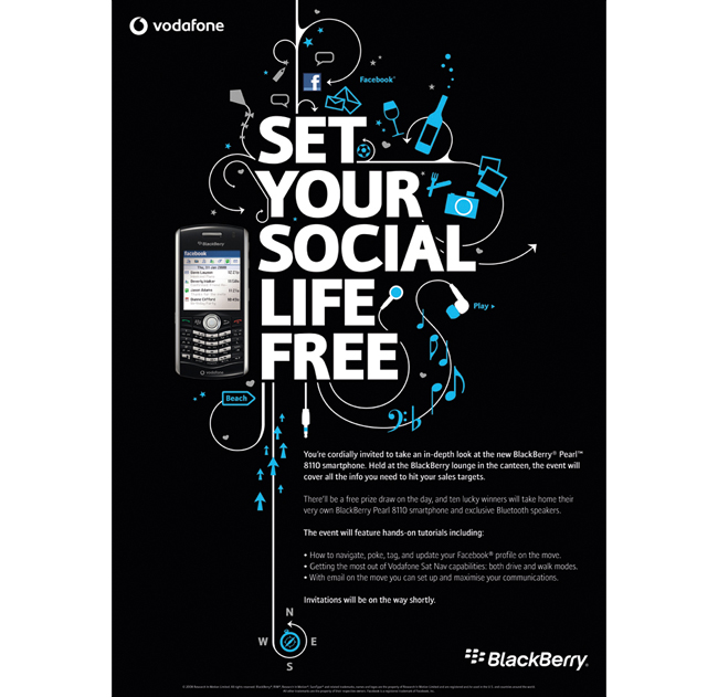
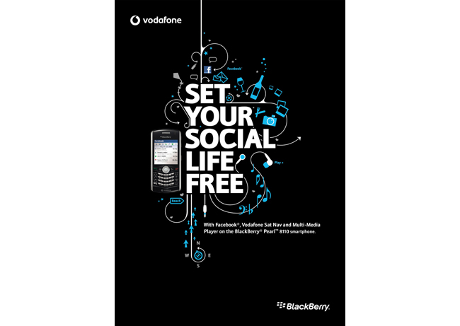
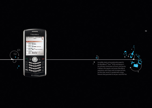
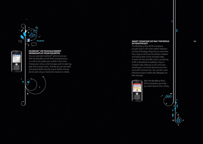
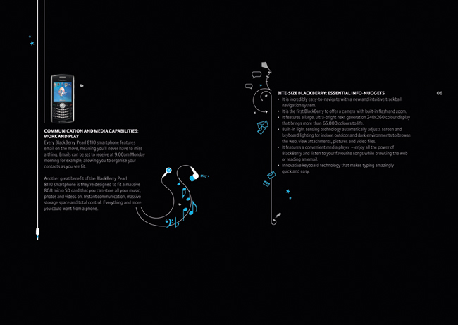
An event to coincide with the launch of the BlackBerry Pearl smartphone. The handset embraced social media, had built in sat nav and it was the first BlackBerry to offer a camera with both flash and zoom. These benefits combined to make it a great tool for leisure, and not just the brand’s traditional business users.
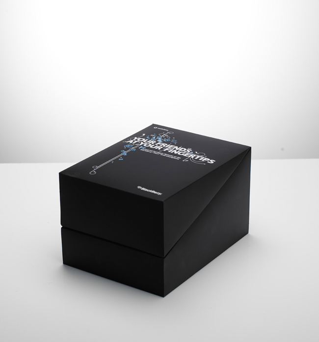
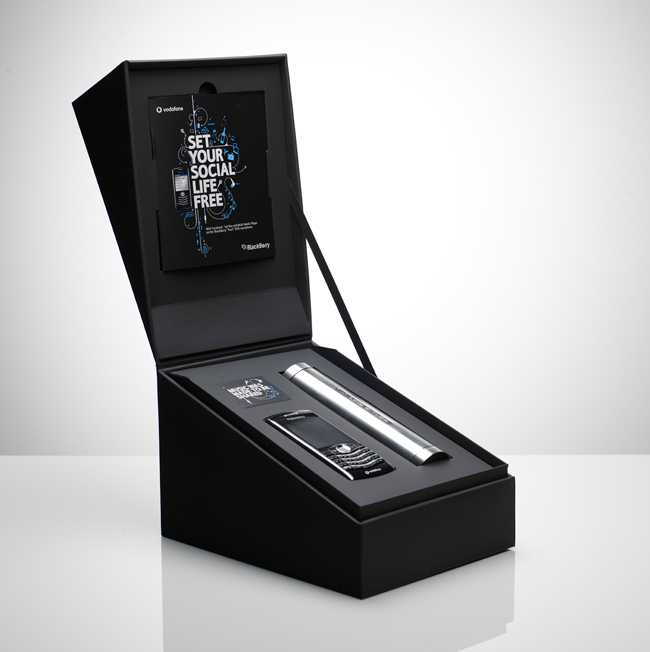
I designed a series of icons to illustrate the different benefits of the phone, and a hero headline. We created a poster, leaflet and pull-up banner for the launch. And a lucky 100 recipients were sent a box that promised to ‘Set Your Social Life Free’, with their own handset and speaker. We worked closely with the printer to ensure that the box had a premium feel, with a black, satin card construction and that the cables were hidden discreetly away in a bespoke compartment.
By admin
On 04, Sep 2012 | In Illustration Press Typography | By admin
Honda – ATV

Press campaign to create awareness of Honda’s range of sports ATVs.
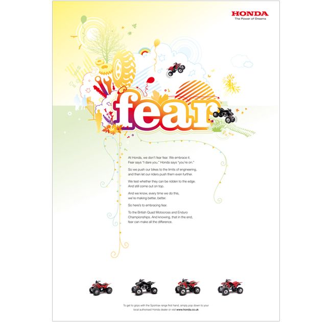
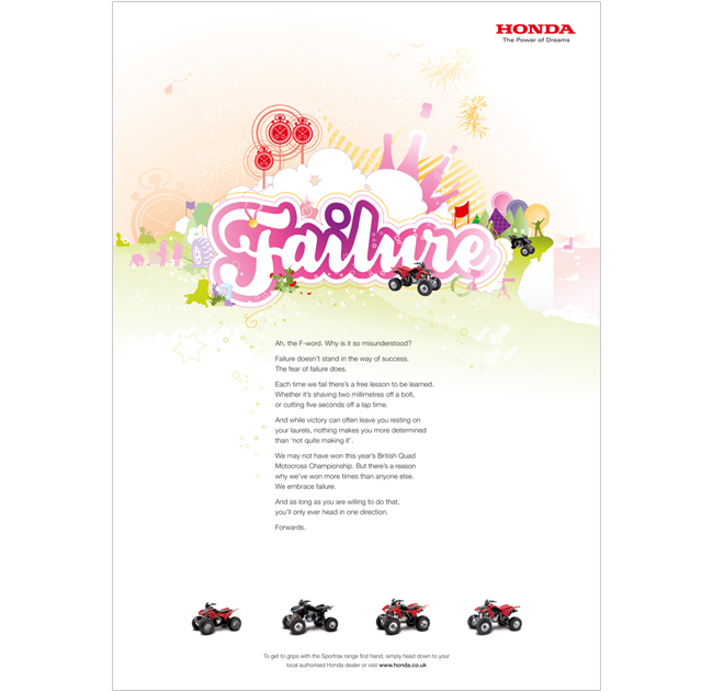
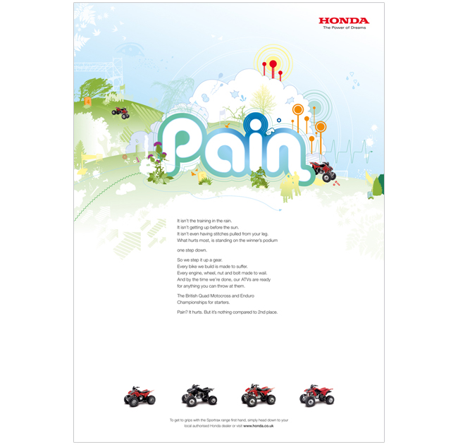
Soichiro Honda is quoted as saying that success is 99% failure. Our long copy ‘poems’ explain that Honda embraces the fear you feel before a race, and they turn it into a positive energy to help them win. We turned the negative words associated with failure into bright, fun illustrations to be celebrated.
I created the look and feel for the campaign using the Fear and Failure ads. I then oversaw my junior designer at the time, as he created the Almost and Pain executions.
The campaign won silver for press at the DMA awards 2008.
By admin
On 04, Sep 2012 | In ATL Pitch Typography | By admin
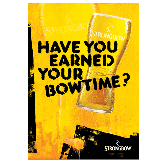
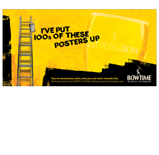
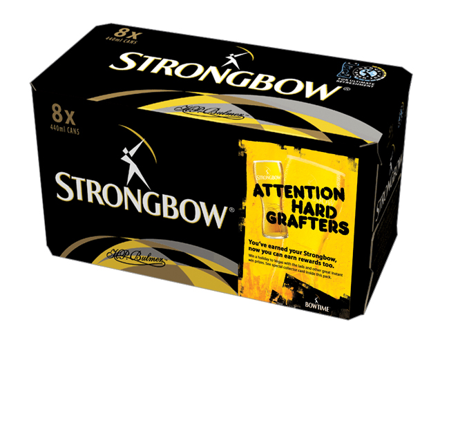
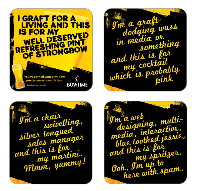
Strongbow – Bowtime

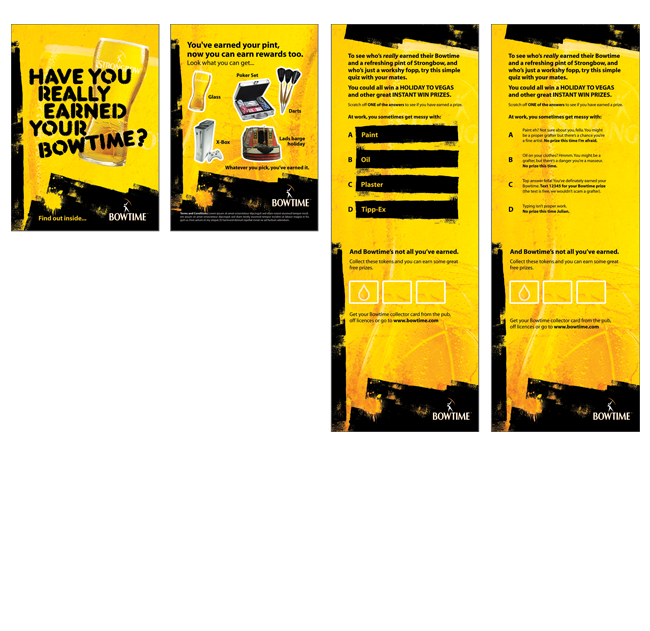
A BTL campaign to tie in with Strongbow’s ATL message of ‘Bowtime, Hard Earned’.
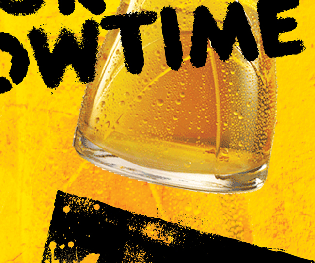
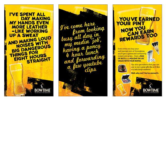
I layered the black roller marks from a hard-grafting painter and decorator over a mouth-watering close up shot of a pint of Strongbow. A rough, stencilled font gave us the honest voice of our Strongbow drinker, deserving a refreshing pint and a bit of Bowtime. And a pretty script font voiced the work-dodging sales manager who was probably drinking a pink cocktail.
For the pitch, we rolled the campaign out over 6 sheets, 48 sheets, on-pack, beer mats, instant win game cards, tent cards…
By admin
On 04, Sep 2012 | In Brand Logo Pitch Typography | By admin
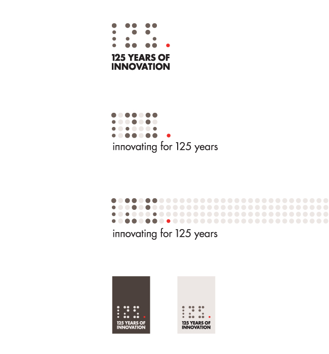
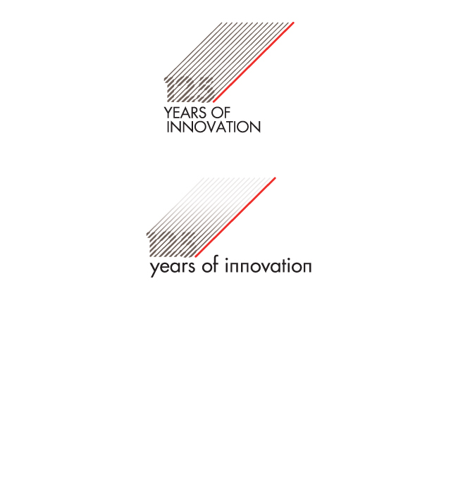
AEG – 125 Years

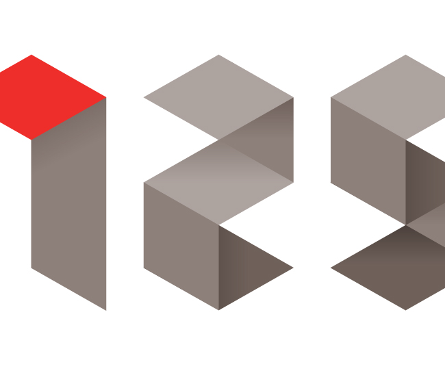
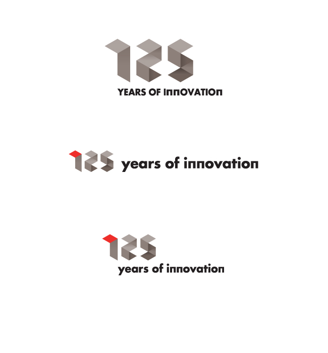
AEG is celebrating 125 years of precision engineering and innovative design. They wanted a logo that echoed these principles. The design needed to sit within the AEG brand look and feel with regard to colour scheme and font.
I developed three initial ideas, being influenced by the design details you might find on an AEG appliance – the dot matrix time display being one example. For another route, I created a series of numbers based on a geometric grid.


